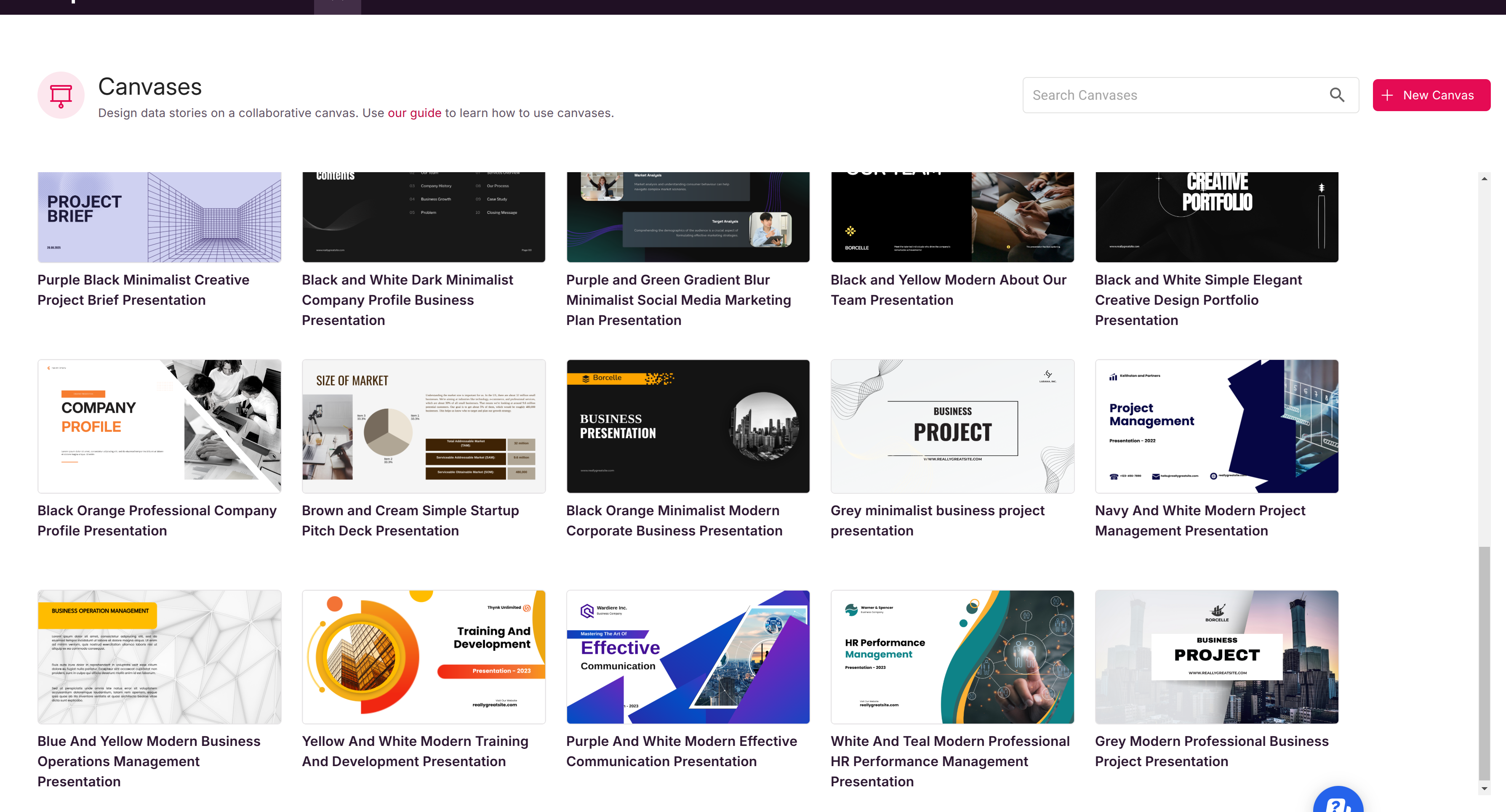
What is a Canvas and What can it Do?
Canvases & Presentations
Scoop Analytics takes a fresh approach to visual analytics—putting the power of "canvases" and presentations at the center, instead of limiting you to static dashboards. This guide walks you through how Scoop's flexible canvas and presentation features help you uncover, design, and communicate insights more effectively.
From Dashboards to Infinite Canvas
Traditional BI tools revolve around fixed dashboards: you create a few charts, arrange them in a grid, and that's your workspace. Scoop replaces this paradigm with the Canvas—an infinite, drag-and-drop surface for layering any type of analysis you want. Forget being boxed in by rigid layouts!
- Flexible Layouts: Place visualizations, KPIs, tables, text, and even images anywhere on your canvas. Stretch, resize, group, and style them to tell your story your way.
- Layering & Composition: Mix summary indicators (KPIs) with detailed charts, diagrams, or raw data tables. Build up your insights layer by layer, visually connecting ideas as you go.
- Actionable Objects: Everything on your canvas is live and interactive—drill down, apply filters, or adjust parameters right in place.
Tip: Start a canvas blank and let your questions shape the layout. No two analyses have to look or flow the same!
Presentations: Analysis to Story in Clicks
When it's time to communicate findings—executive summary, board update, or sales insights—Scoop's Presentations mode turns any canvas into a beautiful, customizable deck.
- Multi-Slide Organization: Structure your analysis into logical slides, each focused on a key finding, trend, or recommendation.
- Drop Visuals Into Slides: Drag chart components, KPIs, and insights directly onto slides. Add commentary text, images, or process diagrams where needed.
- Brand & Style: Upload your company's PowerPoint template or color palette. Scoop automatically matches chart colors and backgrounds for a consistent, on-brand look.
- Export & Share: Instantly export to PowerPoint, PDF, or share live interactive links—no extra formatting work required.
Tip: Leave placeholder (blank) slides if you want to add charts or images later. Scoop preserves your overall template and formatting!
What Makes Scoop Canvases Different?
- Infinite Space: Never outgrow your analytic surface. Scroll, zoom, or group any number of elements.
- Mix Anything: Combine time trends, comparisons, process diagrams, and even embedded spreadsheets on a single surface.
- AI Assistance: Use Scoop's agentic AI features to suggest, auto-generate, or even narrate slides and visuals from your data.
- Storytelling Built-In: Guide viewers through a narrative—show the big picture, drill into root causes, highlight outliers, and finish with takeaways. All in one flow.
- High-Fidelity Exports: Deliver pixel-perfect slides, charts, and analyses directly to PowerPoint, ready for executive audiences.
More than a Dashboard: Canvas Workflows
- Explore: Ingest your data, experiment with filters, and generate quick insights or charts. Drop each onto the canvas as you go.
- Design: Rearrange, annotate, and group your visualizations for clarity. Set the style, size, and order that makes your findings stand out.
- Build Presentations: Organize your analytic narrative as a multi-slide deck, walking your audience from summary to detail and back. Let Scoop auto-generate or add your own commentary.
- Share & Iterate: Export finished decks for meetings—or share interactive canvases for deeper, real-time exploration.
Tip: Start your analysis canvas-first, not dashboard-first. As your workflow becomes a story, Scoop makes it effortless to turn explorations into polished, shareable presentations.
When To Use Canvases and Presentations
- When you need to analyze freshly uploaded or connected data quickly—without waiting for IT or a developer to design a dashboard.
- If you want to explore data deeply, ask agentic (AI-powered) questions, or compare periods, groups, and segments visually.
- When you need to communicate insights with stunning, branded presentations for any level of audience—from analyst coworkers to the C-suite.
- If your business users are comfortable in spreadsheets, but want to go further—combining classic ad hoc logic with modern visualization and storytelling.
Get Started
- Open a new Canvas from your workspace. Start dropping KPIs or charts as you explore.
- When ready, switch to Presentation mode to organize your analysis as a polished, communicative deck.
- Use Scoop's AI and automation features to auto-summarize, generate slides, and even help explain your findings.
- Export your work, present directly from Scoop, or share a live link.
Tip: Canvases and presentations are always saved in your workspace. Version history, multi-user collaboration, and role-based sharing are all built-in.
Canvas Modes
When you have selected a canvas to display or edit, initially you will be in the canvas viewer mode, indicated by the pointer icon in the upper left (as seen below).

Viewer Mode
In the viewer mode, you can zoom in or zoom out of the canvas (with the zoom control in the lower right of the screen), as well as pan left, right, up or down to see the entire canvas.

Also, in viewer mode, all canvas objects are interactive. You can:- Change prompt values
- Drill on charts or tables
- Click into spreadsheet sheetlets to edit cells
- Mouseover or hover over objects to see more detail## Edit ModeIf you would like to edit the canvas to add new objects, modify existing objects, or delete objects, you select the edit icon (next to the pointer arrow to the right). Once you are in edit mode, if you click on an object you will select it vs. interacting with it in viewer mode. In edit mode you can:- Add a new object
- Delete an object
- Set the object's outer style (background and border)
- Open the object to edit it
- Change some display settings (like whether column headers or a grid are shown on sheetlets)
- Open the underlying Google sheet (in the case of sheetlets)
Presentation Mode
By clicking the third icon in the mode bar, you enter presentation mode. This mode only works if there are frames on your canvas. Each frame becomes a slide in presentation mode and you can, accordingly present your slides in a designated order, move backward and foward, and interact with the data elements present on those slides while in presentation mode.
Scoop makes the journey from raw data to executive decision seamless. Replace static dashboards with flexible canvases—and let your data storytelling shine!