Visualizing Data not by Time
Analyze data by categories, segments, and distributions
While Scoop excels at time-series analysis, many business questions don't involve time as the primary dimension. You may want to compare regions, analyze product mix, or understand customer segments. Scoop's category-based visualization handles these scenarios.
When to Use Category Analysis
| Analysis Type | Example Question |
|---|---|
| Distribution | How is revenue distributed across regions? |
| Comparison | Which products perform best? |
| Segmentation | What's the breakdown by customer type? |
| Ranking | Who are our top performers? |
| Composition | What's our product mix? |
Switching to Category Mode
By default, Scoop analyzes data over time. To switch to category-based analysis:
- Enable Advanced Mode using the slider in the upper right
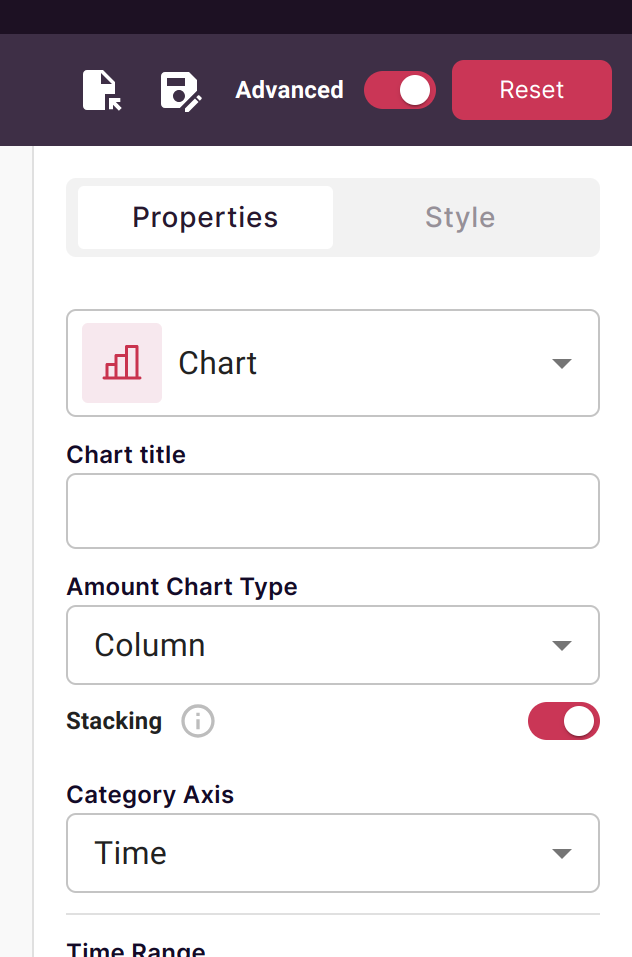
- Select a category column for your primary axis (instead of Time)
What Data Is Shown
When you select a non-time category:
| Dataset Type | Data Shown |
|---|---|
| Transactional | All records in the dataset |
| Snapshot | Most recent snapshot only |
This ensures you're analyzing current state when time isn't the focus.
Building Category Visualizations
Step 1: Choose Your Category Axis
Select the dimension you want to analyze by:
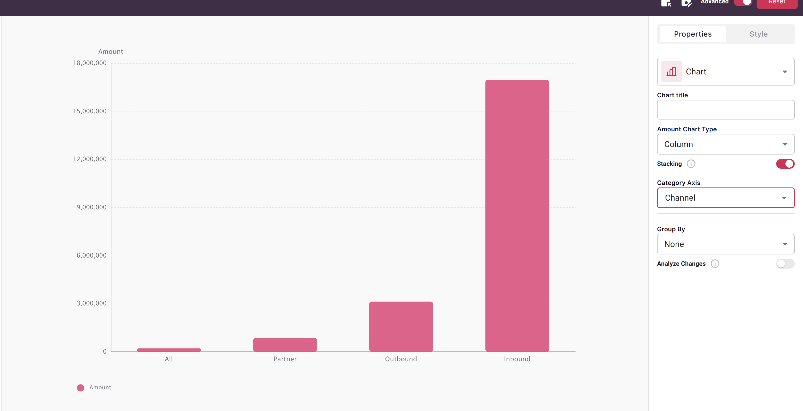
Common category axes:
- Region, Territory
- Product, Product Line, Category
- Sales Channel, Source
- Customer Segment, Account Type
- Rep, Team, Manager
Step 2: Add Grouping (Optional)
Add a second dimension to break down each category:
Example combinations:
- Revenue by Region, grouped by Product
- Deals by Stage, grouped by Sales Rep
- Customers by Segment, grouped by Industry
Step 3: Select Chart Type
Choose a visualization that fits your analysis:
| Chart Type | Best For |
|---|---|
| Bar Chart | Comparing values across categories |
| Pie/Donut | Showing composition (parts of whole) |
| Stacked Bar | Comparing with breakdown by group |
| Table | Detailed category data with multiple metrics |
Common Category Analysis Patterns
Regional Performance
Category Axis: Region
Metrics: Revenue, Deal Count, Win Rate
Grouping: Product Line

Shows: How each region performs across products
Sales Pipeline by Stage
Category Axis: Stage
Metrics: Pipeline Value, Deal Count
Grouping: Sales Rep

Shows: Pipeline distribution and rep focus areas
Product Mix Analysis
Category Axis: Product Category
Metrics: Units Sold, Revenue, Margin
Grouping: Customer Segment

Shows: Which products appeal to which customers
Customer Segmentation
Category Axis: Customer Tier
Metrics: Avg Deal Size, Lifetime Value
Grouping: Industry

Shows: Customer value across segments and industries
Multiple Dimensions
You can layer multiple dimensions for deeper analysis:
- Primary category: Main grouping (e.g., Region)
- Secondary grouping: Breakdown within each category (e.g., Product)
- Filters: Focus on specific subsets (e.g., only Q4 data)
Example: Multi-Dimensional Analysis
Primary: Sales Channel (Direct, Partner, Online)
Group by: Deal Size Bucket (Small, Medium, Large)
Filter: This Quarter Only
Metric: Revenue, Count

Result: See which channels excel at which deal sizes
Combining Time and Category
You can use category analysis alongside time:
Time-Filtered Category Analysis
- Set category as your axis (e.g., Product)
- Use time as a filter (e.g., Last Quarter)
- See category breakdown for that time period
Comparing Periods by Category
Create multiple visualizations:
- Category breakdown for Current Period
- Same breakdown for Prior Period
- Place side-by-side on a canvas for comparison
Best Practices
Choosing Categories
- Select categories with meaningful, distinct values
- Avoid categories with too many values (>20 gets hard to read)
- Consider grouping small categories into "Other"
Effective Groupings
- Pair complementary dimensions (Region + Product, not Region + Territory)
- Use grouping to answer "what's driving this?" questions
- Limit to 2 dimensions to keep visualizations readable
Chart Selection
- Use bar charts for comparisons (rankings, performance)
- Use pie charts sparingly (only for composition with fewer than 6 categories)
- Use tables when you need multiple metrics per category
Drilling Down
Category visualizations support drilling:
- Click any bar, slice, or row
- Select a dimension to drill by
- See the breakdown of that specific category
Example drill path:
- Start: Revenue by Region
- Click: "West" bar
- Drill by: Sales Rep
- Result: West region revenue by each rep
Troubleshooting
No Data Showing
- Verify you're not filtering out all data
- Check if snapshot dataset has data for today
- Ensure the category column has non-null values
Too Many Categories
- Add a filter to limit to relevant categories
- Create a calculated field to group small categories
- Use Top N filtering to show only largest
Unexpected Totals
- Check if you're looking at snapshot vs. full history
- Verify filters aren't excluding data
- Confirm you're aggregating correctly (sum vs. count vs. average)
Related Topics
- Charting Time Series Data - Time-based analysis
- How to Create a Chart - Chart creation basics
- Interactive Charts - Drilling and filtering