AI Generated Color Themes
Automatic color schemes that match your presentations
When you import a PowerPoint presentation, Scoop automatically analyzes its colors and generates matching themes for your data visualizations. This ensures your charts and graphs harmonize with your existing design without manual color matching.
How AI Color Themes Work
┌────────────────────────────────────────────────────────────┐
│ 1. IMPORT                                                   │
│    Upload PowerPoint → Scoop analyzes colors, fonts        │
├────────────────────────────────────────────────────────────┤
│ 2. ANALYZE                                                  │
│    AI extracts color palette using color theory            │
│    Identifies primary, secondary, accent colors            │
├────────────────────────────────────────────────────────────┤
│ 3. GENERATE                                                 │
│    Creates two matching themes:                            │
│    - Standard (subtle, professional)                       │
│    - Bold (higher contrast, impactful)                     │
└────────────────────────────────────────────────────────────┘
What Gets Analyzed
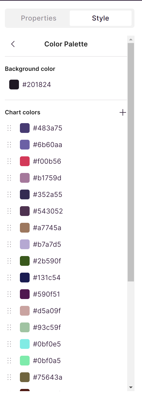
Scoop examines your presentation to extract:
| Element | How It's Used |
|---|---|
| Background colors | Base palette derivation |
| Text colors | Contrast calculations |
| Accent colors | Chart highlights and emphasis |
| Theme colors | Primary palette foundation |
| Graphics colors | Secondary palette elements |
Generated Themes
For each imported presentation, Scoop generates two AI color themes:
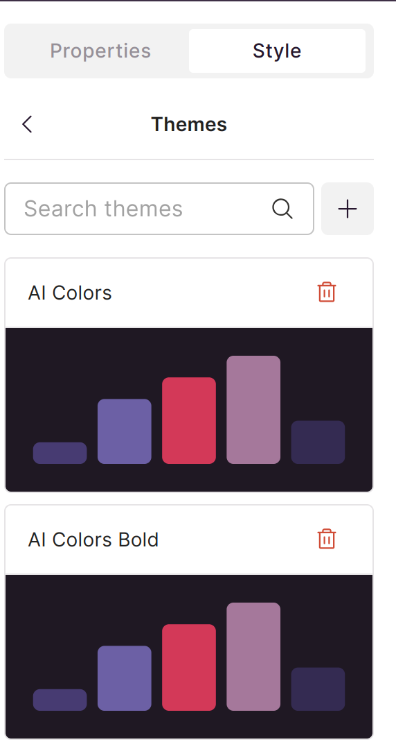
Standard Theme
- Subtle, professional appearance
- Lower contrast for understated visuals
- Works well for detailed data displays
- Ideal for executive presentations
Bold Theme
- Higher contrast colors
- More impactful visual presence
- Better for large displays
- Ideal for presentations to larger audiences
Using AI Themes
In Explorer
When creating visualizations:
- Open Explorer with your dataset
- Create your chart or table
- Click on Theme or Style options
- Select one of the AI-generated themes
Theme Selection
Your AI themes appear alongside default Scoop themes:
- Named after your presentation
- Available for any visualization in that canvas
- Can be applied to multiple charts for consistency
Example: Theme Generation
Original Presentation:

Generated Color Scheme:
Applied to Visualization:
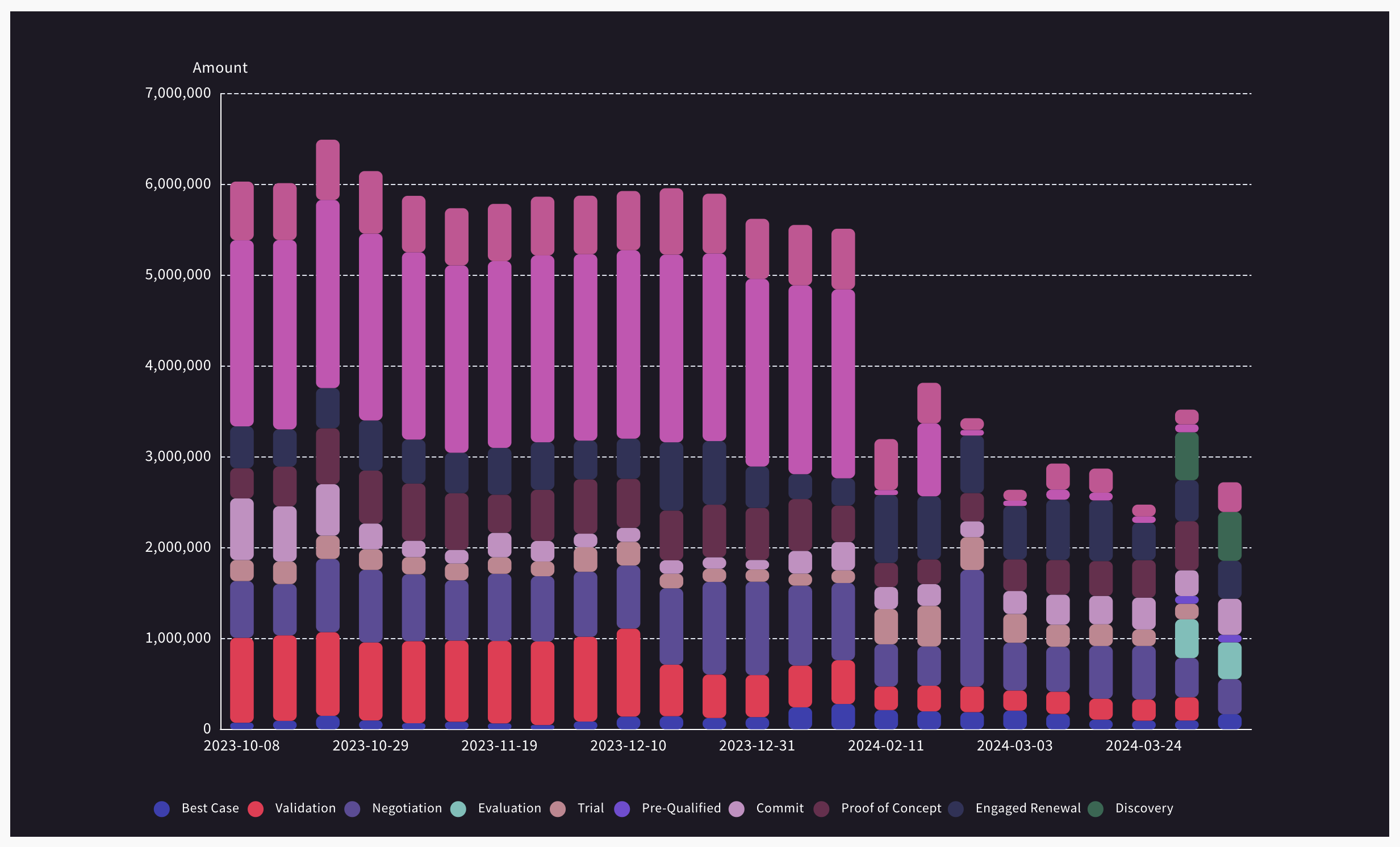
Notice how the chart colors complement the slide design without clashing.
Color Theory Applied
Scoop's AI uses color theory principles:
| Principle | Application |
|---|---|
| Complementary colors | Ensures chart elements are distinguishable |
| Color harmony | Creates pleasing combinations |
| Contrast ratios | Maintains readability |
| Saturation balance | Prevents visual fatigue |
Best Practices
When to Use AI Themes
- Always when using imported presentations
- When brand consistency matters
- For client-facing materials
- When design polish is important
Theme Consistency
- Use the same AI theme across all visualizations in a presentation
- Consider Bold theme for projection, Standard for print
- Test on your actual display environment
Manual Adjustments
If the AI theme doesn't quite fit:
- Select the closest AI theme as a starting point
- Manually adjust individual chart colors
- Save custom colors for reuse
Troubleshooting
Theme Not Generated
- Ensure presentation was imported (not just uploaded as image)
- Check that PowerPoint had defined theme colors
- Try reimporting the presentation
Colors Don't Match Expectations
- Verify using the AI theme, not a default theme
- Check if presentation had unusual color combinations
- Consider using manual color selection
Theme Missing in Dropdown
- Refresh the browser
- Verify you're editing the correct canvas
- Check theme settings in canvas properties
Related Topics
- Importing PowerPoint - Import presentations into Scoop
- Visual Themes - Other theme options
- Drawing Objects - Add visual elements
Updated 8 months ago
Did this page help you?