Scoop is optimized for analyzing data over time. Comparing metrics across periods reveals whether things are improving, declining, or holding steady—essential insights for business performance. Scoop's time series capabilities go far beyond basic line charts, offering sophisticated date handling, period comparisons, and multi-date analysis that would require extensive coding in traditional BI tools.
| Feature | Purpose | Access |
|---|
| Period Frequency | Daily, weekly, monthly, quarterly, yearly aggregation | Time dropdown |
| Period End Type | Rolling (relative to today) vs Calendar (fixed dates) | Time settings |
| Date Selection | Which date column to analyze by | Metric settings |
| Time Range | How far back to show data | Range selector |
| Period Comparison | Compare current vs prior periods | Comparison toggle |
Every dataset has multiple ways to analyze time. Understanding these unlocks Scoop's full analytical power.
| Date Type | Description | Example |
|---|
| Snapshot Date | When data was captured/ingested | Report run date |
| Entity Dates | Dates on individual records | Created date, close date |
| Calculated Dates | Derived from other fields | Days since last activity |
A sales opportunities report ingested daily has three natural time dimensions:
| Date | What It Represents | Analysis Use |
|---|
| Snapshot Date | Date each report was uploaded | Pipeline value over time |
| Created Date | When opportunity was created | New business generation |
| Close Date | Expected close date | Forecasting, pipeline by expected timing |
Key Insight: Scoop tracks all these dates and lets you analyze the same dataset by any of them—no data transformation needed.
Click any numeric column to visualize it. Scoop automatically creates a time series:
| Action | Result |
|---|
| Click "Amount" | Shows Amount by Snapshot Date, daily |
| Click "Count" | Shows record count by Snapshot Date, daily |
| Click any measure | Time series with smart defaults |
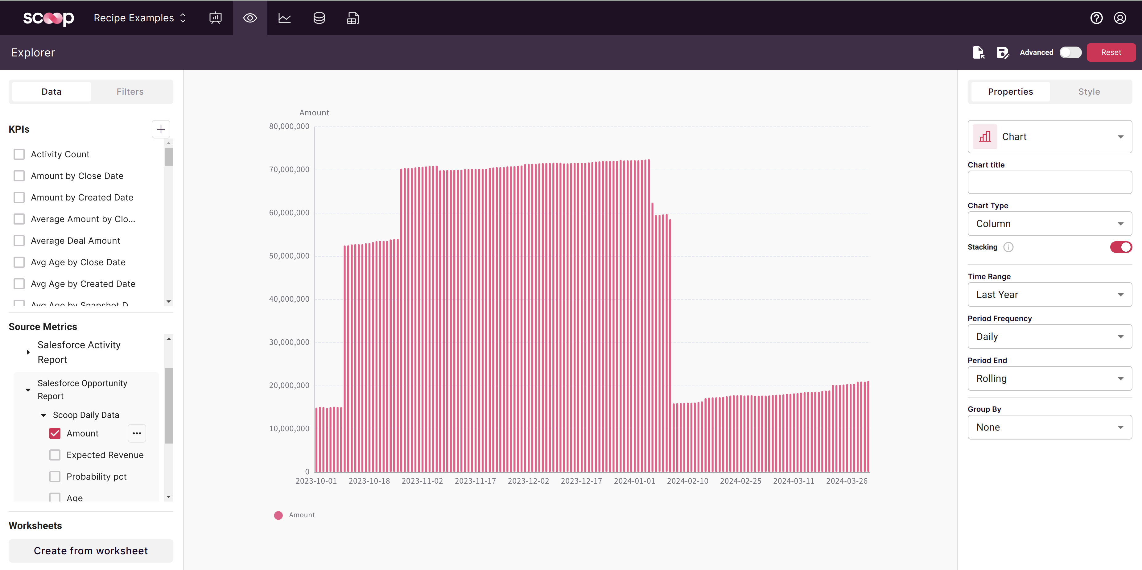
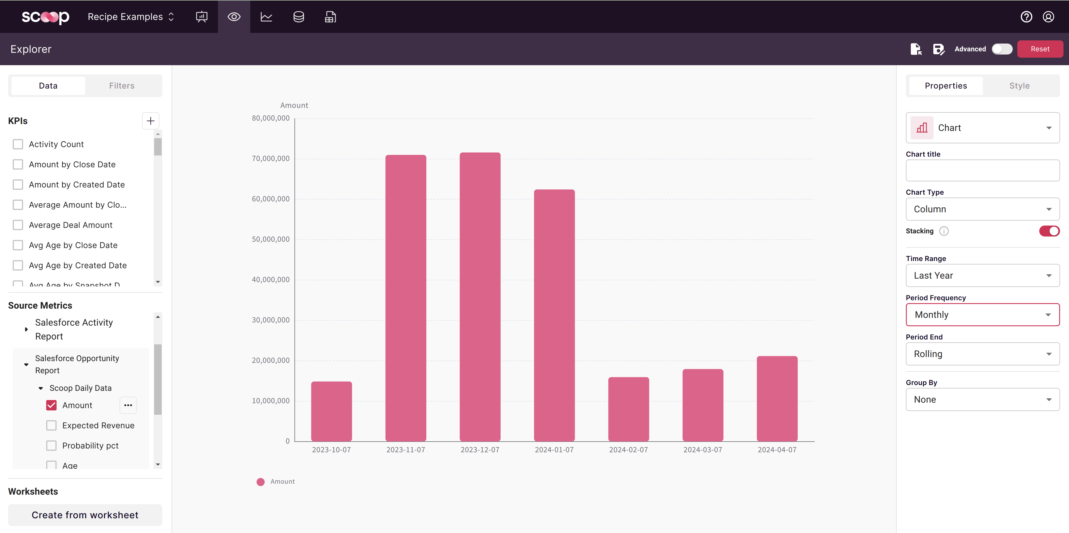
Choose how to aggregate time:
| Period | Best For | Example Output |
|---|
| Daily | Short-term tracking, operational data | Apr 1, Apr 2, Apr 3... |
| Weekly | Medium-term trends, less noise | Week of Apr 1, Week of Apr 8... |
| Monthly | Business reporting, standard KPIs | January, February, March... |
| Quarterly | Executive reporting, seasonal analysis | Q1 2024, Q2 2024... |
| Yearly | Long-term trends, year-over-year | 2022, 2023, 2024... |
Control how much history to display:
| Range | Shows | Use Case |
|---|
| Last Day | Most recent 24 hours | Real-time monitoring |
| Last Week | Last 7 days | Weekly reviews |
| Last Month | Last 30 days | Monthly reporting |
| Last Quarter | Last 90 days | Quarterly business reviews |
| Last Year | Last 365 days | Annual trends |
| Custom | Any date range | Specific analysis periods |
This critical setting affects how periods are calculated.
| Characteristic | Description |
|---|
| Definition | Periods relative to today |
| Example | "Last month" = 30 days ago to today |
| Benefit | No partial periods at edges |
| Dates shown | Rolling end dates (not calendar boundaries) |
When to use: Default choice for most analysis. Ensures you're always comparing complete periods.
| Characteristic | Description |
|---|
| Definition | Fixed calendar boundaries |
| Example | "Last month" = Jan 1 to Jan 31 |
| Benefit | Matches standard business reporting |
| Dates shown | Calendar month/quarter/year ends |
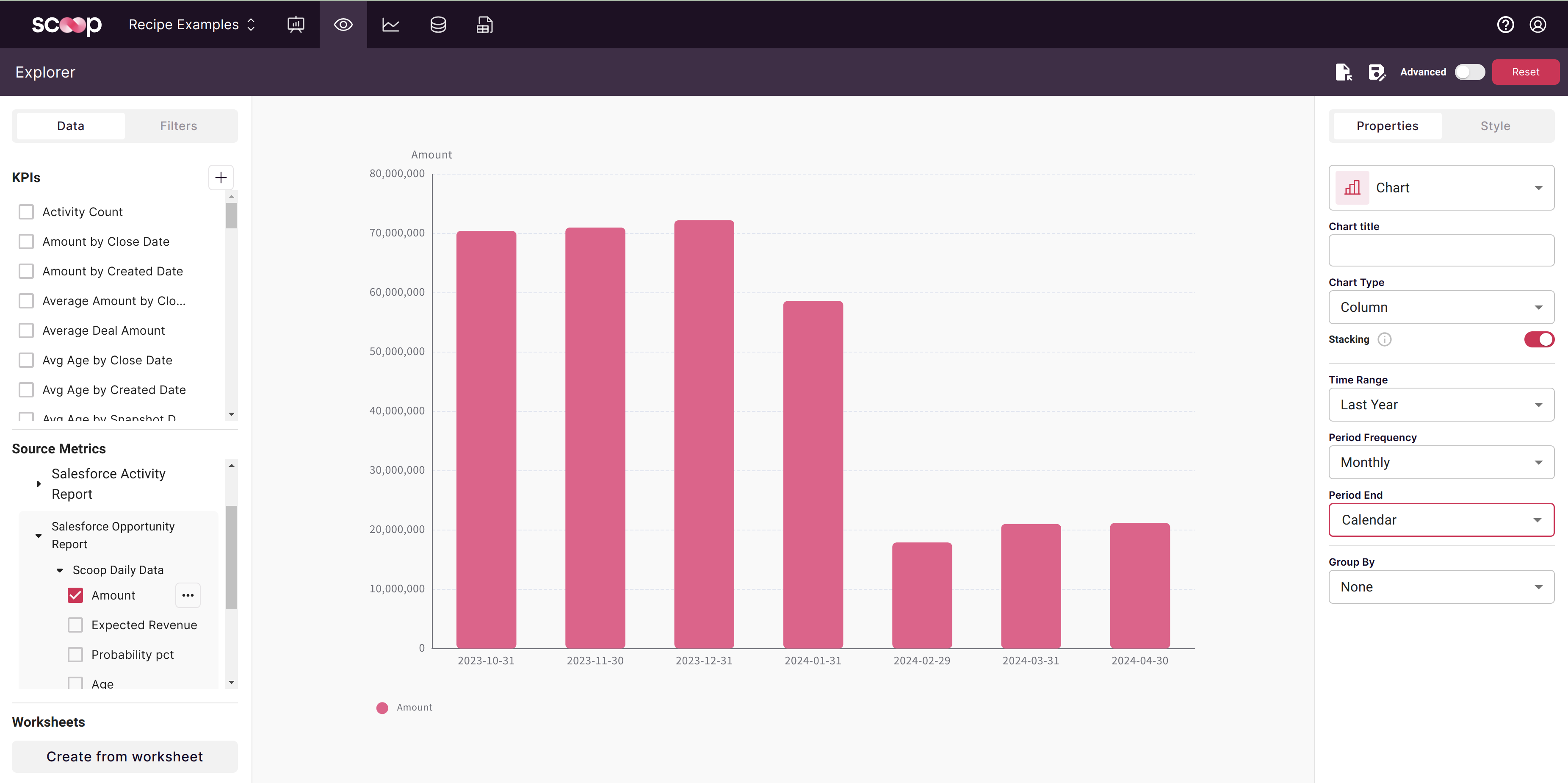
When to use: When comparing to financial reports, budgets, or external benchmarks that use calendar periods.
| Scenario | Recommended | Why |
|---|
| Daily operational review | Rolling | Avoids partial current period |
| Month-end financial report | Calendar | Matches accounting periods |
| Executive dashboard | Rolling | Always current, complete periods |
| Budget comparison | Calendar | Budgets are calendar-based |
| Trend analysis | Rolling | Smoother comparisons |
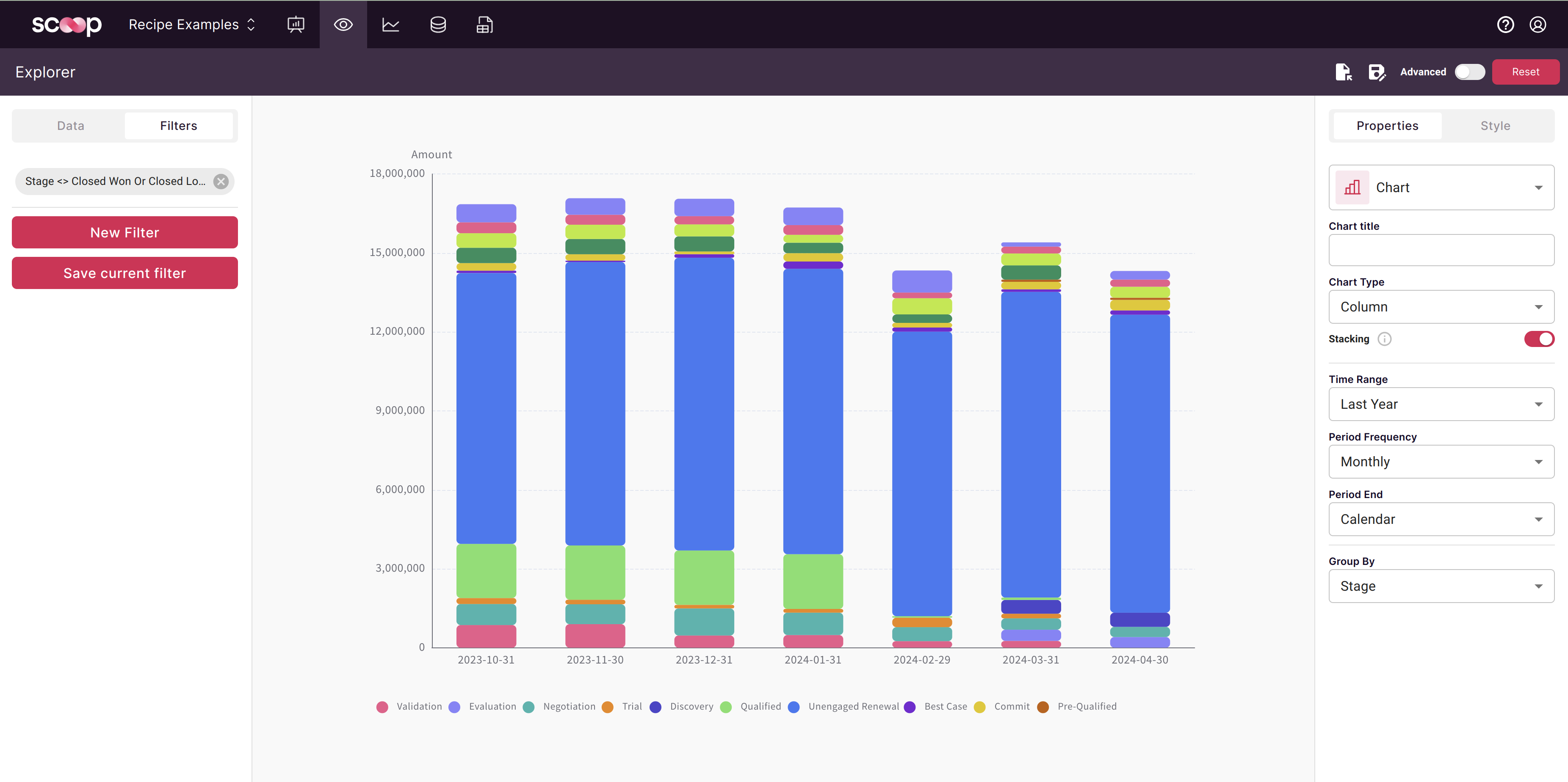
Add dimensions to see how metrics break down over time.
| Step | Action | Result |
|---|
| 1 | Click "Group By" dropdown | Shows available dimensions |
| 2 | Select dimension (e.g., Stage) | Stacked/grouped time series |
| 3 | Optionally filter | Focus on relevant groups |
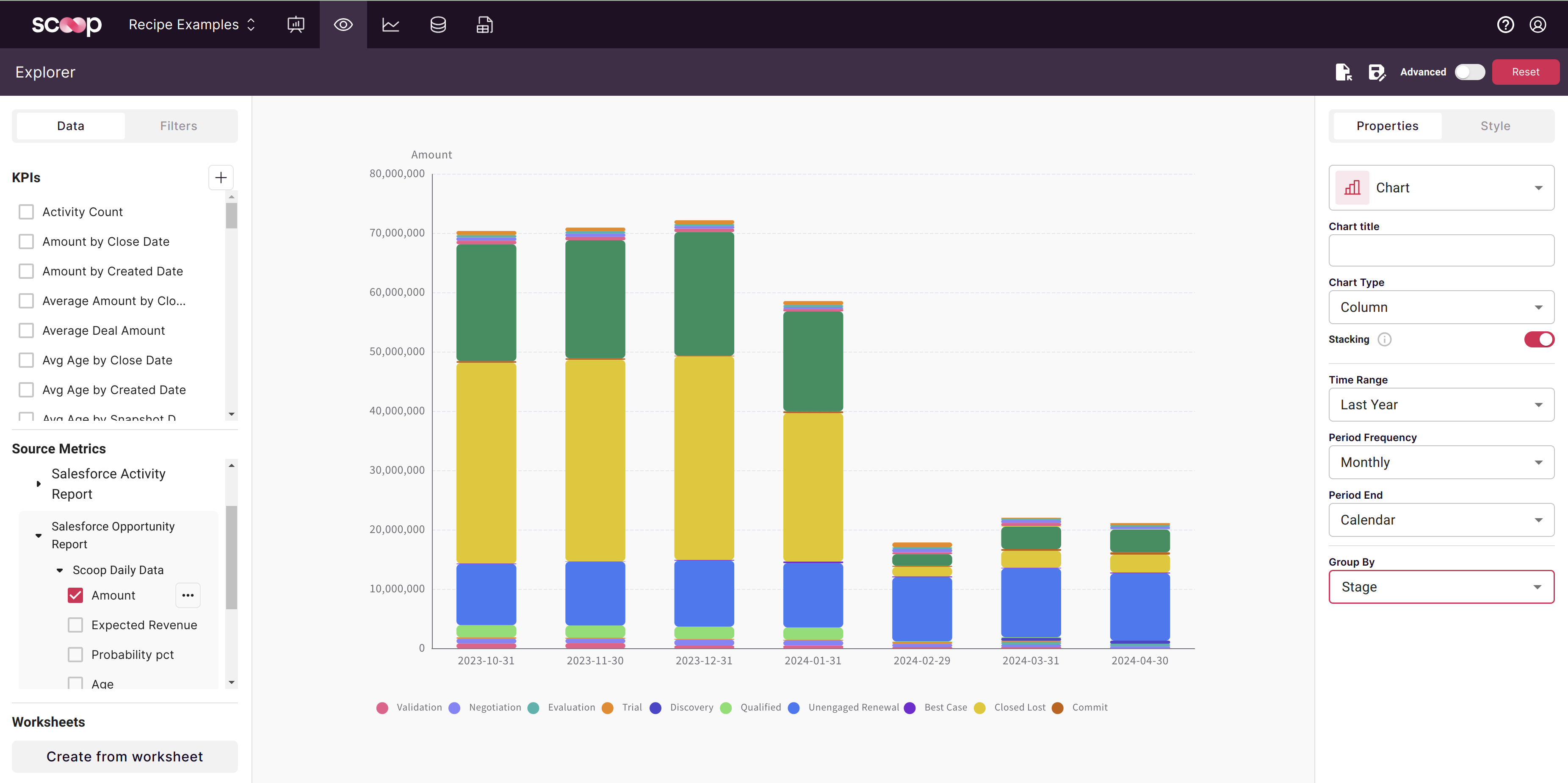
Group Amount by Stage to see pipeline health:
| What You See | What It Tells You |
|---|
| Stage composition | Which stages hold most value |
| Stage trends | Are early stages growing? |
| Stage balance | Healthy mix vs. concentration |
| Metric | Group By | Insight |
|---|
| Revenue | Product | Product mix over time |
| Deals | Sales Rep | Rep performance trends |
| Tickets | Category | Issue type evolution |
| Pipeline | Stage | Sales funnel health |
| Users | Region | Geographic growth |
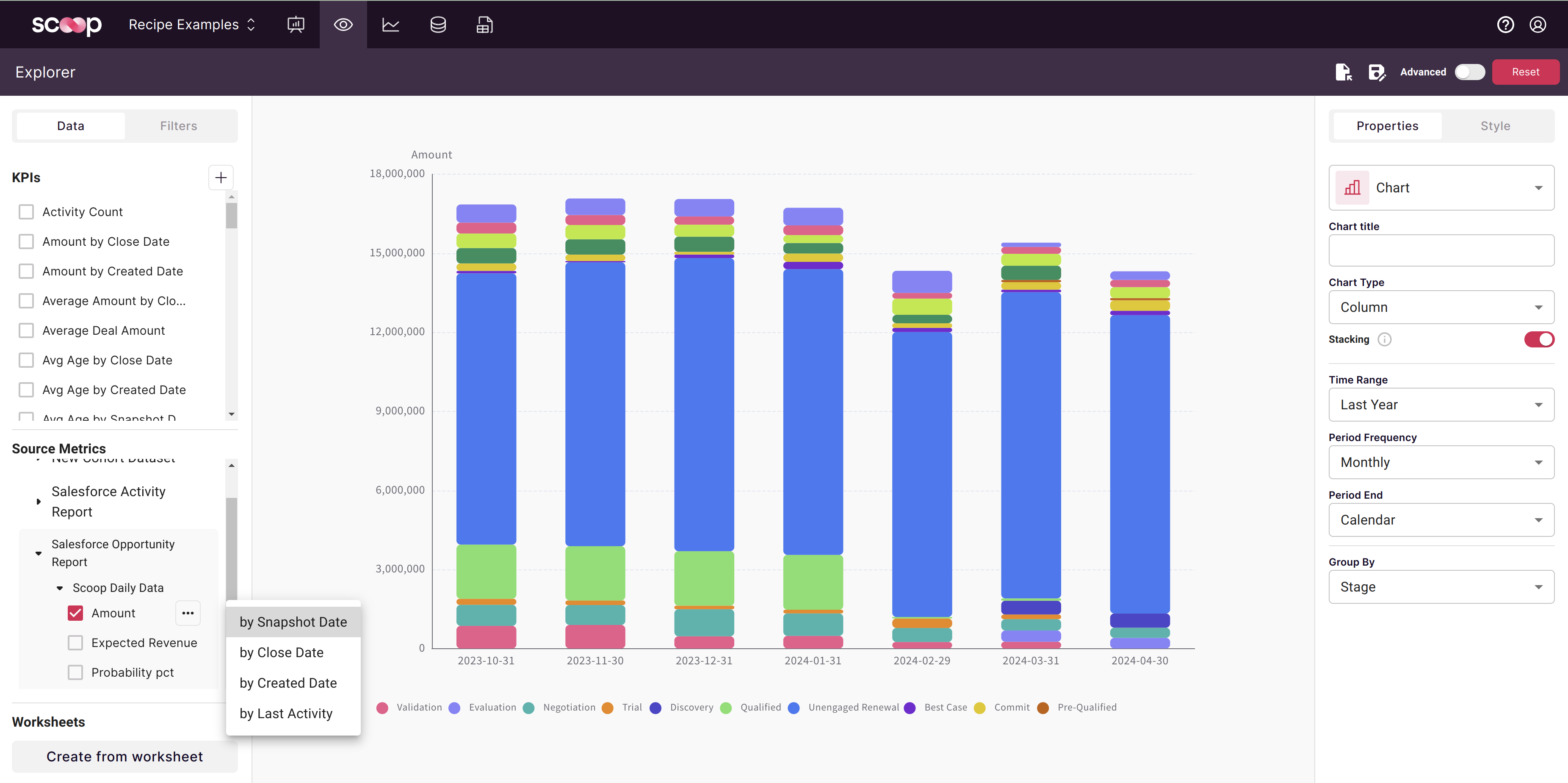
Switch which date drives the time axis.
| Step | Action |
|---|
| 1 | Find your metric in the panel |
| 2 | Click the three dots (⋮) menu |
| 3 | Select "Change Date Column" |
| 4 | Choose desired date |
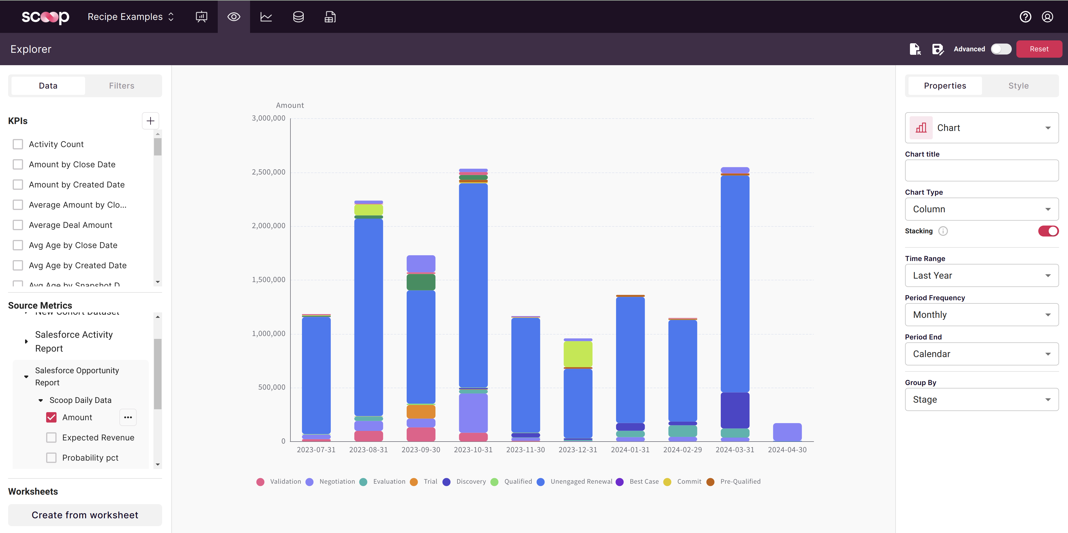
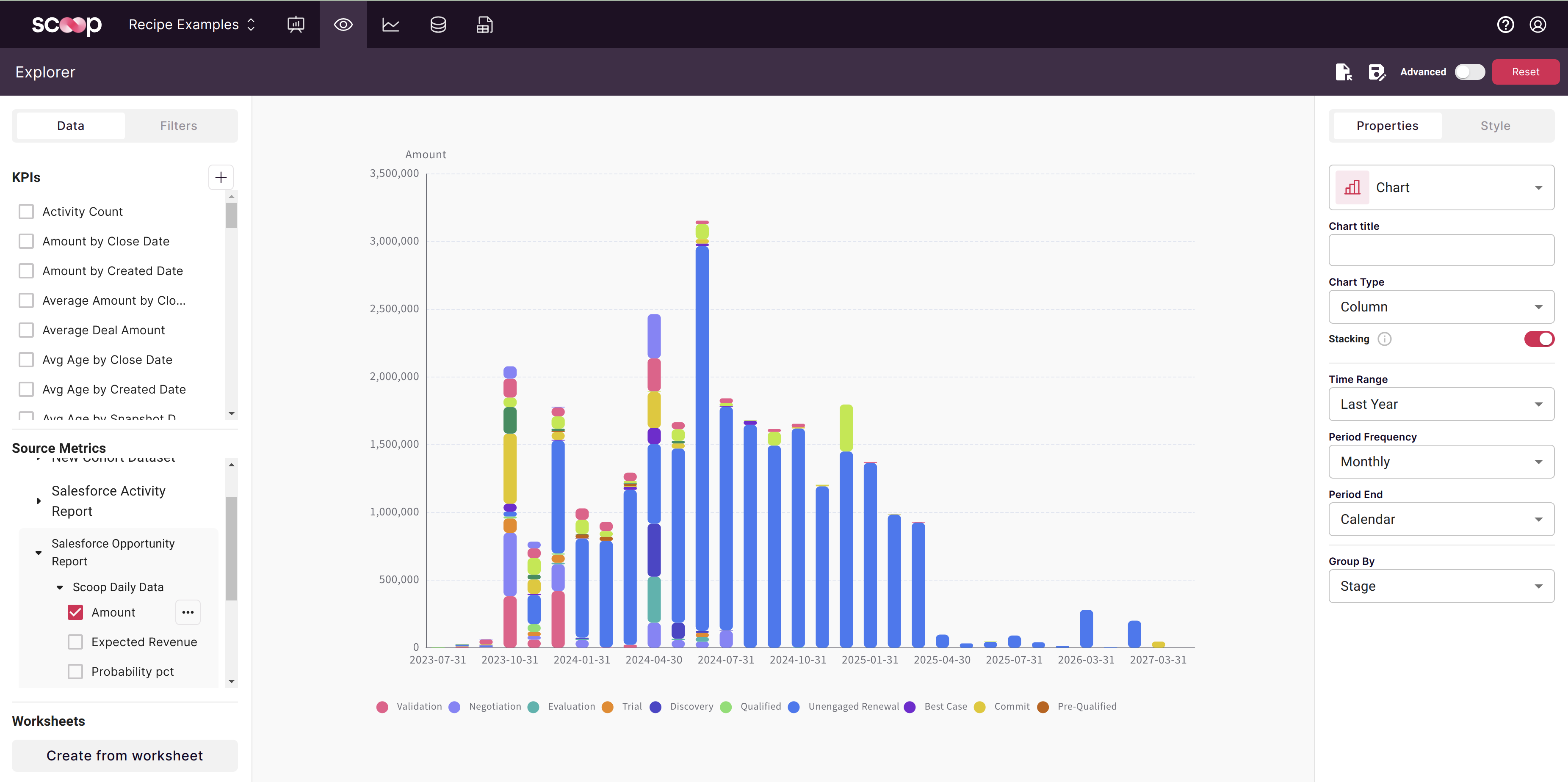
| Date Type | What You Analyze | Typical Values |
|---|
| Snapshot Date | State at each point in time | Higher (cumulative view) |
| Entity Dates | Current state of records by that date | Lower (deduplicated) |
Why values differ:
- Snapshot analysis counts a deal in every snapshot it appears
- Entity date analysis counts each deal once (its current state)
Using the same sales opportunities dataset:
| Analysis Date | Shows | Sample Insight |
|---|
| Snapshot Date | Pipeline value over time | "Pipeline grew from $10M to $18M this year" |
| Created Date | New opportunities by creation | "Created $3M in new deals this month" |
| Close Date | Expected revenue by timing | "Have $5M forecasted to close in Q2" |
Compare current period to previous:
| Comparison | Formula | Use Case |
|---|
| Month over Month | This month vs. last month | Monthly progress |
| Quarter over Quarter | This Q vs. last Q | Quarterly trends |
| Year over Year | This period vs. same period last year | Annual trends, seasonality |
| Method | How |
|---|
| Dual axis | Add same metric twice, shift one by period |
| Calculated KPI | Create "vs. Prior Period" compound KPI |
| Side-by-side | Two charts with different date ranges |
See Creating KPIs for building time-shifted metrics.
| View | Shows | Example |
|---|
| Point-in-time | Value at each period | Monthly revenue |
| Cumulative | Running total | YTD revenue |
Smooth out noise with rolling calculations:
| Average | Benefit |
|---|
| 7-day moving average | Smooth daily volatility |
| 4-week moving average | Smooth weekly patterns |
| 3-month moving average | Identify true trends |
| Technique | Purpose |
|---|
| Year-over-year overlay | See seasonal patterns |
| Same period comparison | Compare like periods |
| Seasonal indexing | Normalize for seasonality |
| Chart Type | Best For | Example |
|---|
| Line | Trends, multiple series | Revenue over 12 months |
| Area | Cumulative values, composition | Stacked pipeline by stage |
| Column | Period comparisons | Monthly vs. monthly |
| Combo | Different metrics together | Revenue (bars) + margin % (line) |
| Scenario | Recommended Chart |
|---|
| Single metric trend | Line |
| Part-to-whole over time | Stacked Area |
| Discrete period values | Column |
| Two scales (value + rate) | Combo with dual axis |
| Many series comparison | Line (limit to 5-7) |
| Practice | Why |
|---|
| Consistent date formats | Accurate time parsing |
| Complete time coverage | No gaps in trends |
| Appropriate granularity | Enough data points per period |
| Practice | Why |
|---|
| Start Y-axis at zero | Accurate perception of change |
| Limit series to 5-7 | Visual clarity |
| Use consistent colors | Easy tracking across charts |
| Add annotations | Highlight significant events |
| Practice | Why |
|---|
| Check data completeness | Partial periods mislead |
| Consider seasonality | Don't compare Dec to Jan naively |
| Use rolling periods | Avoid partial period issues |
| Combine with grouping | Understand drivers of trends |
| Cause | Solution |
|---|
| Missing data periods | Check data ingestion schedule |
| Filtered out values | Review filter settings |
| Date parsing issues | Verify date column format |
| Issue | Check |
|---|
| Values too high | May be using snapshot date (counting duplicates) |
| Values too low | May be using entity date (deduplicated) |
| Wrong aggregation | Verify sum vs. count vs. average |
| Issue | Solution |
|---|
| Can't compare periods | Use same period type (both rolling or calendar) |
| Partial current period | Switch to rolling periods |
| Dates don't match reports | Verify calendar vs. rolling setting |
| Issue | Solution |
|---|
| Slow rendering | Reduce time range or increase period |
| Too many data points | Use weekly instead of daily |
| Chart too dense | Limit series or time range |
| Metric | Date | Period | Insight |
|---|
| Revenue | Snapshot | Monthly, Rolling | Monthly bookings trend |
| Pipeline | Snapshot | Weekly | Pipeline health tracking |
| Win Rate | Close Date | Quarterly | Closing efficiency |
| Metric | Date | Period | Insight |
|---|
| Active Users | Event Date | Daily | Engagement trends |
| New Signups | Created Date | Weekly | Growth rate |
| Churn | Cancelled Date | Monthly | Retention health |
| Metric | Date | Period | Insight |
|---|
| Tickets | Created Date | Daily | Support volume |
| Resolution Time | Resolved Date | Weekly | Efficiency trends |
| SLA Compliance | Due Date | Monthly | Performance tracking |