KPI Summaries
Highlight key metrics with at-a-glance performance indicators
KPI (Key Performance Indicator) summaries display your most important metrics in a clear, scannable format. Each KPI tile shows a primary value along with comparison data—making it easy to see performance at a glance.
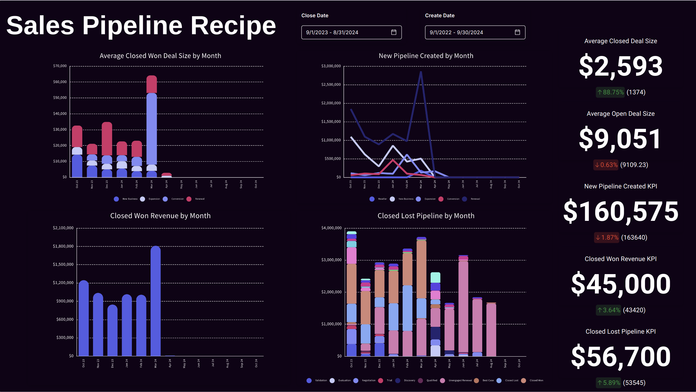
What KPI Summaries Show
Each KPI tile displays:
| Element | Description |
|---|---|
| Primary Value | The main metric (e.g., $1.2M Revenue) |
| Comparison | Prior period or target value |
| Change Indicator | Arrow showing direction (↑ up, ↓ down) |
| Percentage Change | How much the metric changed |
| Trend Color | Green for positive, red for negative changes |
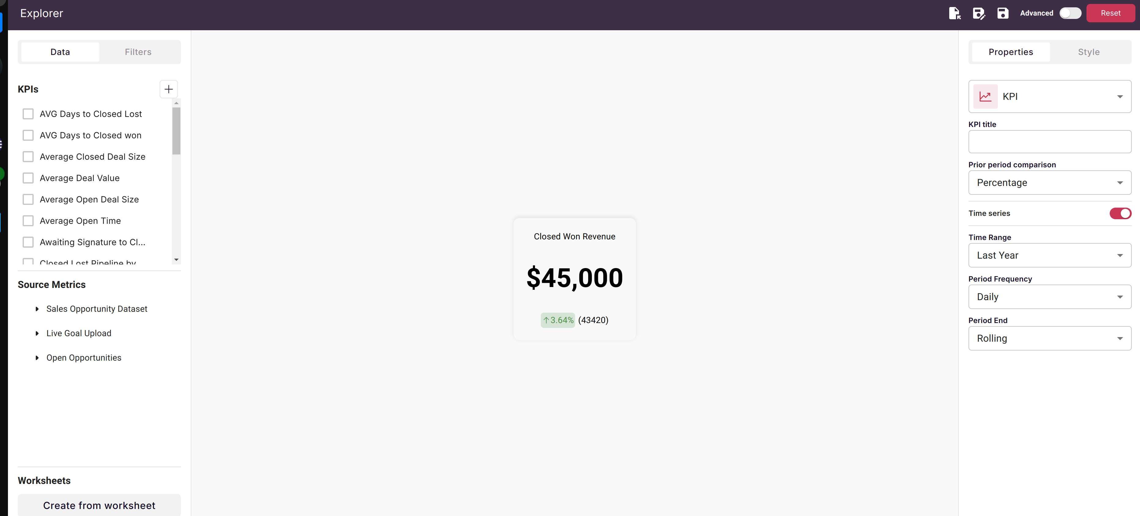
Creating a KPI Summary
Step 1: Add KPI to Canvas
- Open your canvas in edit mode
- Click the + Add button in the toolbar
- Select KPI from the object types
- Click on the canvas where you want to place the KPI
Step 2: Configure the Metric
- Select Dataset: Choose the dataset containing your metric
- Choose Metric: Select the column to measure (e.g., Revenue, Count, etc.)
- Set Aggregation: Sum, Average, Count, Min, or Max
- Apply Filters: Optionally filter to specific segments
Step 3: Set Up Comparison
For time series data:
- Scoop automatically compares to the prior period
- Monthly data compares to previous month
- Weekly data compares to previous week
- Daily data compares to previous day
For non-time-series data:
- Set a target/reference value for comparison
- Enter the value you want to measure against
Step 4: Customize Display
- Title: Add a descriptive label (e.g., "Monthly Revenue", "Active Customers")
- Format: Set number formatting (currency, percentage, decimal places)
- Size: Resize the tile to fit your layout
Comparison Types
Time Series Comparisons
When your dataset has snapshot dates, KPIs automatically compare:
| Data Frequency | Compares To |
|---|---|
| Daily | Previous day |
| Weekly | Same day last week |
| Monthly | Same day last month |
| Quarterly | Same day last quarter |
| Yearly | Same day last year |
Example: If today's Active Deals is 142 and yesterday was 138, the KPI shows:
- Primary: 142
- Change: +4 (+2.9%)
- Indicator: ↑ Green
Reference Value Comparisons
For datasets without time series, set a target:
| Use Case | Reference Value |
|---|---|
| Sales quota | Monthly target |
| Budget | Planned amount |
| Benchmark | Industry average |
| Goal | Team objective |
Example: If Revenue is $95,000 and target is $100,000, the KPI shows:
- Primary: $95,000
- Change: -$5,000 (-5%)
- Indicator: ↓ Red (below target)
KPI Best Practices
Choose Meaningful Metrics
Focus on metrics that:
- Drive business decisions
- Are actionable
- Change frequently enough to be worth monitoring
- Have clear "good" and "bad" directions
Good KPIs:
- Monthly Recurring Revenue (MRR)
- Customer Acquisition Cost (CAC)
- Pipeline Value
- Conversion Rate
- Average Deal Size
Avoid:
- Vanity metrics with no action path
- Metrics that rarely change
- Metrics without context
Use Consistent Formatting
| Metric Type | Format Example |
|---|---|
| Currency | $1,234,567 or $1.2M |
| Percentage | 23.4% |
| Count | 1,234 or 1.2K |
| Duration | 14 days |
Group Related KPIs
Arrange KPIs in logical groups:
- Sales: Revenue, Deals, Win Rate, Cycle Time
- Marketing: Leads, MQLs, Conversion Rate, CAC
- Customer Success: Churn, NPS, Retention, Expansion
Consider Color Psychology
Scoop uses color to indicate performance:
- Green: Positive change / above target
- Red: Negative change / below target
Make sure your metric's direction makes sense:
- Revenue up = Green ✓
- Churn up = Should be Red (flip the comparison)
- Costs down = Green ✓
Layout Ideas
Executive Dashboard
Arrange 4-6 top-level KPIs across the top of your canvas:
┌──────────┐ ┌──────────┐ ┌──────────┐ ┌──────────┐
│ Revenue  │ │ Pipeline │ │ Deals    │ │ Win Rate │
│ $1.2M ↑  │ │ $4.5M ↓  │ │ 47 ↑     │ │ 28% ↑    │
└──────────┘ └──────────┘ └──────────┘ └──────────┘

     [Detailed charts and tables below]
Departmental Views
Create sections with department-specific KPIs:
Sales KPIs          │  Marketing KPIs
────────────────────│────────────────────
Revenue  Pipeline   │  Leads    MQLs
Deals    Win Rate   │  CAC      Conversion
Performance Cards
Large KPIs for wall displays or meetings:
┌─────────────────────────┐
│                         │
│     $1,247,500          │
│     Monthly Revenue     │
│     ↑ 12.3% vs LM       │
│                         │
└─────────────────────────┘
Connecting KPIs to Details
KPIs work best when users can drill into details:
- Place KPI tiles at the top of your canvas
- Add related charts below showing trends
- Include tables with supporting detail data
- Use consistent filters across all elements
Example Layout:
- Top: KPI showing "Deals Closed This Month: 47"
- Middle: Line chart showing deals closed over time
- Bottom: Table listing all 47 deals with details
Troubleshooting
KPI Shows Unexpected Value
- Check filters applied to the KPI
- Verify the aggregation type (Sum vs Count vs Average)
- Confirm the date range matches your expectation
- Look for data quality issues in the source dataset
Comparison Shows Wrong Period
- Verify the dataset has the expected date column
- Check that snapshot frequency matches your comparison expectation
- For non-time-series, confirm reference value is set correctly
Color Seems Wrong
- Some metrics should flip direction (lower is better)
- Check if your metric interpretation matches the color logic
- Consider if the comparison period is appropriate
Related Topics
- Interactive Charts and Tables - Add detail visualizations
- Sheetlets - Include editable spreadsheet data
- Presenting a Canvas - Share KPI dashboards with stakeholders
Updated 8 months ago