Process Analysis
Overview of Process Analysis
Snapshot datasets provide the ability to deeply analyze how a process performs. By analyzing snapshot history, Scoop can identify and analyze changes in status over time. For detail on how this is done see Snapshot Datasets and Tracking Changes. However, once a dataset is setup as a snapshot dataset, any of the attributes in that dataset can be analyzed for their change history. With that change history, Scoop can analyze things like conversion rates, cycle times, and likelihoods of eventual success, all key questions in trying to understand business processes and where, perhaps things break down. Key examples of where this can be helpful include:
- Sales process analysis: Here one typically analyzes sales stages over time to understand how long things spend at various stages, how likely they are to move to other stages and how that can vary based on different factors. This allows someone to look through the noise to find where a process might be performing poorly.
- Marketing lead analysis: Many marketing organizations run leads through different stages as well, and understanding how leads progress can be very helpful in optimizing their conversion.
- Renewal analysis: Understanding how a renewal process unfolds can be helpful in ensuring that it operates smoothly.
- Service issue analysis: Understanding how issues work their way towards resolution in more complicated service processes could uncover opportunity to streamline or find efficiencies.
- Engineering bug tracking: Understanding how issues or bugs get processed or resolved across various teams, products, or features might help an engineering team allocate resources more efficiently.
To analyze a process one clicks on the Insights icon in the middle of the top navigation bar.
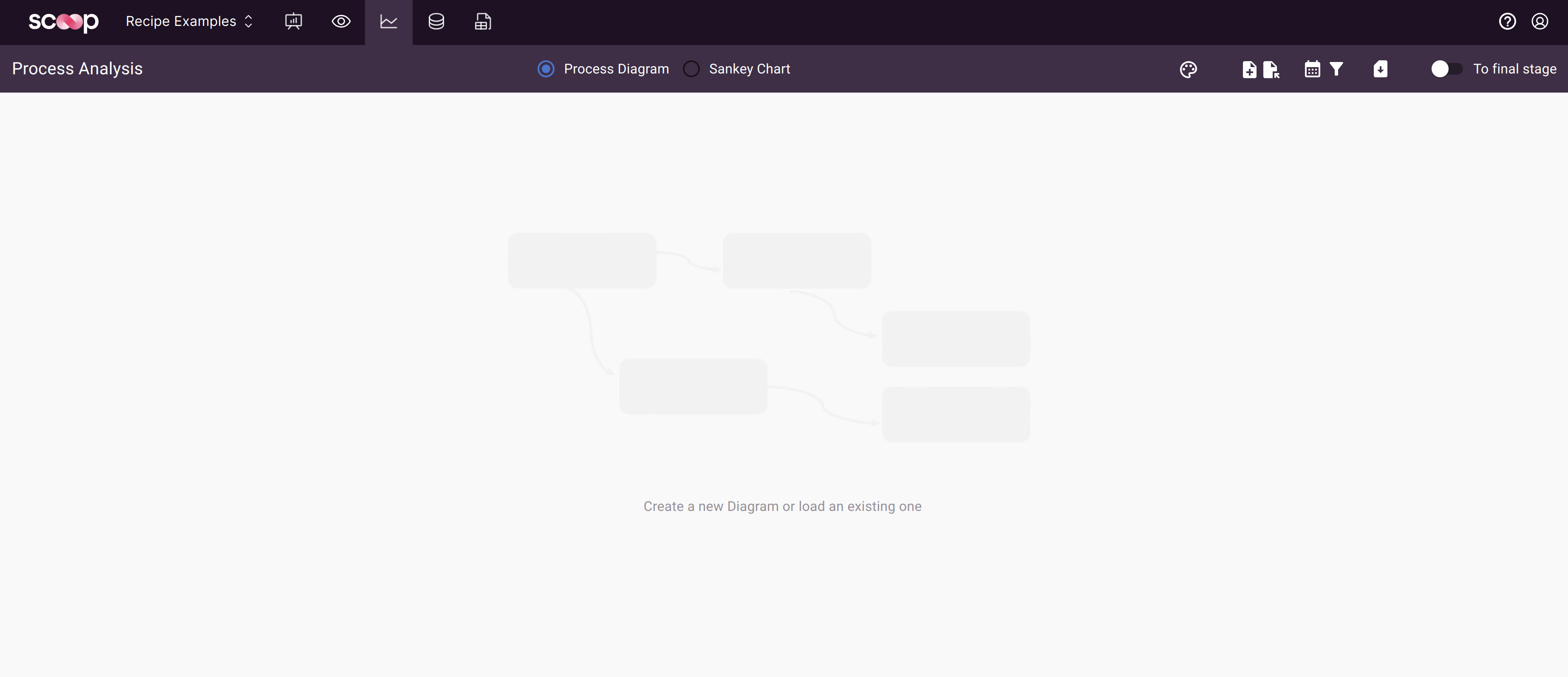
One can then create a new analysis by clicking on the new diagram button.
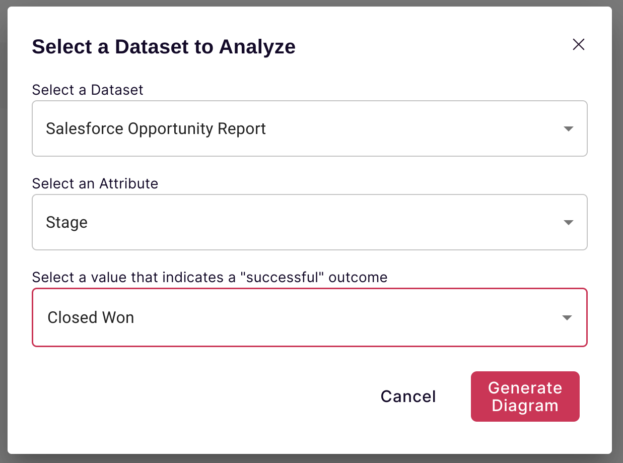
Then one can select the following:
- Dataset: this is the snapshot dataset to analyze
- Attribute: this is the attribute whose history we are going to analyze. Scoop will analyze all changes to this attribute over time for each unique key in the snapshot dataset, allowing you to explore how those changes occur.
- Success Value: Most processes have a final/successful state. For example, in a sales process, it is typically when a deal closes successfully which is often referred to as "Closed Won". Knowing what the successful end state is allows Scoop to provide analysis of how likely something ever is to get to success, regardless of where it starts out in a process.
There are two ways Scoop allows you to analyze a process:
- Process Diagram: This is a diagram which shows all the states of your attribute and then the likelihood an item will move from any one state to the next, and how long on average it takes to do so. You can filter this diagram for various types of items to see how this changes.
- Sankey Diagram: This diagram helps you visualize how items move through a process after many different steps, so you can see how a population of items will evolve over time.
Process Diagram
After selecting your dataset, attribute and success criteria, Scoop will construct an initial process diagram.
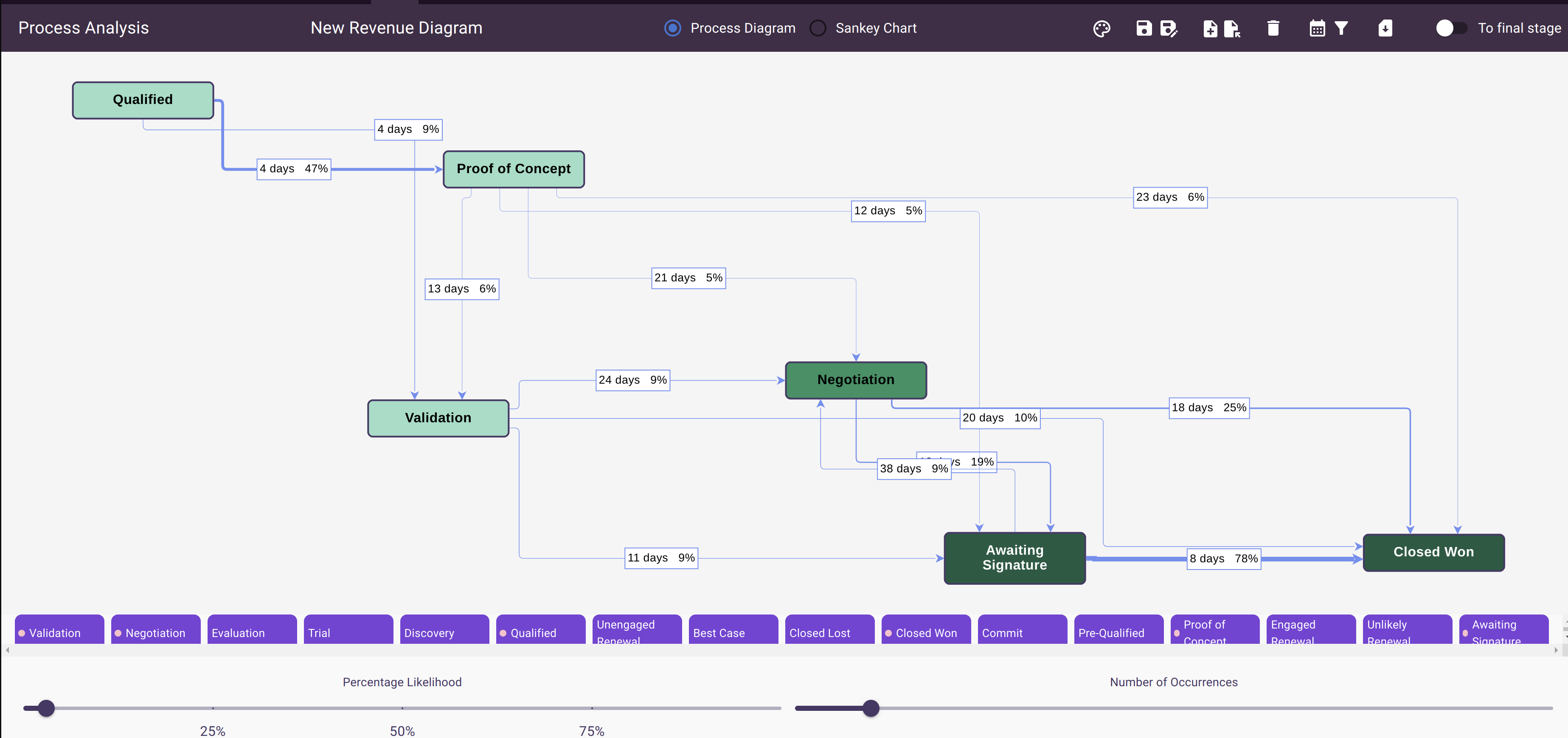
This diagram shows each state that the attribute of choice (in this case sales stage) has been in and how long and how likely it is to move to another state. In addition, each state has a color that is proportional to the likelihood that any item starting in that state ever winds up in the final, successful state. With this information, for example, a sales leader can measure:
- How long do deals spend in each stage and where do they get stuck
- What is the likelihood a deal goes from any one stage to any other
- What is the overall sales cycle and what is the likelihood that a deal will ever close as a win.
Filtering Out Uncommon Changes
In many processes there are expected paths for something to take. In the sales example, one reasonably would expect a deal to start in the first stage, say as a qualified lead, and then pass one by one, in order through each of the stages of the sales process and ultimately move into closed one. However, in the real world things do not always go according to plan. Sometimes a deal with skip one or more stages or even move backwards. Hopefully, however, these are pretty rare and are exceptions. Scoop provides a couple of controls that help you filter out uncommon changes so that you can focus on the most important ones. There are two sliders to do that.
- Percentage Likelihood: This slider allows you to rule out things that are relatively unlikely to occur. So even if there are a reasonable number of them in absolute value, you may want to rule them out.
- Number of Occurrences: This slider allows you to rule out things that have only happened a few times. This is more helpful for stages that are less likely overall.
Filtering Process Diagram Data
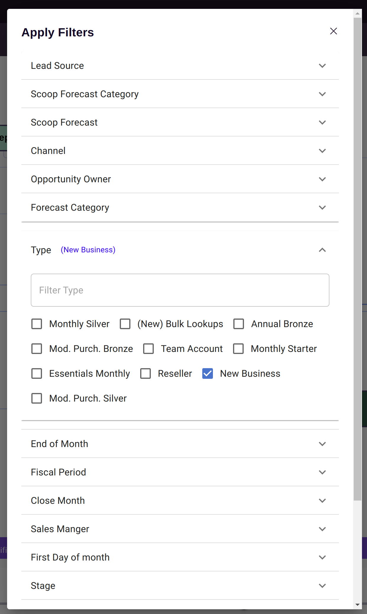
By default, Scoop uses your entire snapshot dataset for the process diagram. However, it is possible to filter the dataset to different date ranges of interest, and also for specific attributes. Clicking on the filter icon at the top brings up the process filter dialog. Here you can filter any attribute in your dataset.
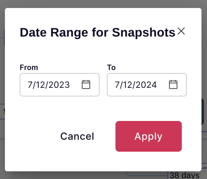
You can also filter your process diagram for a given date range if you want to focus on that.
Applying Theme Colors
You can also select a Scoop theme to change the color scheme for your diagram.
Saving and Loading Diagrams
You can save a process diagram and all of its filter settings using the save and load icons in the icon bar. When you save a diagram, you can also place that diagram on a canvas for later use.
Sankey Analysis
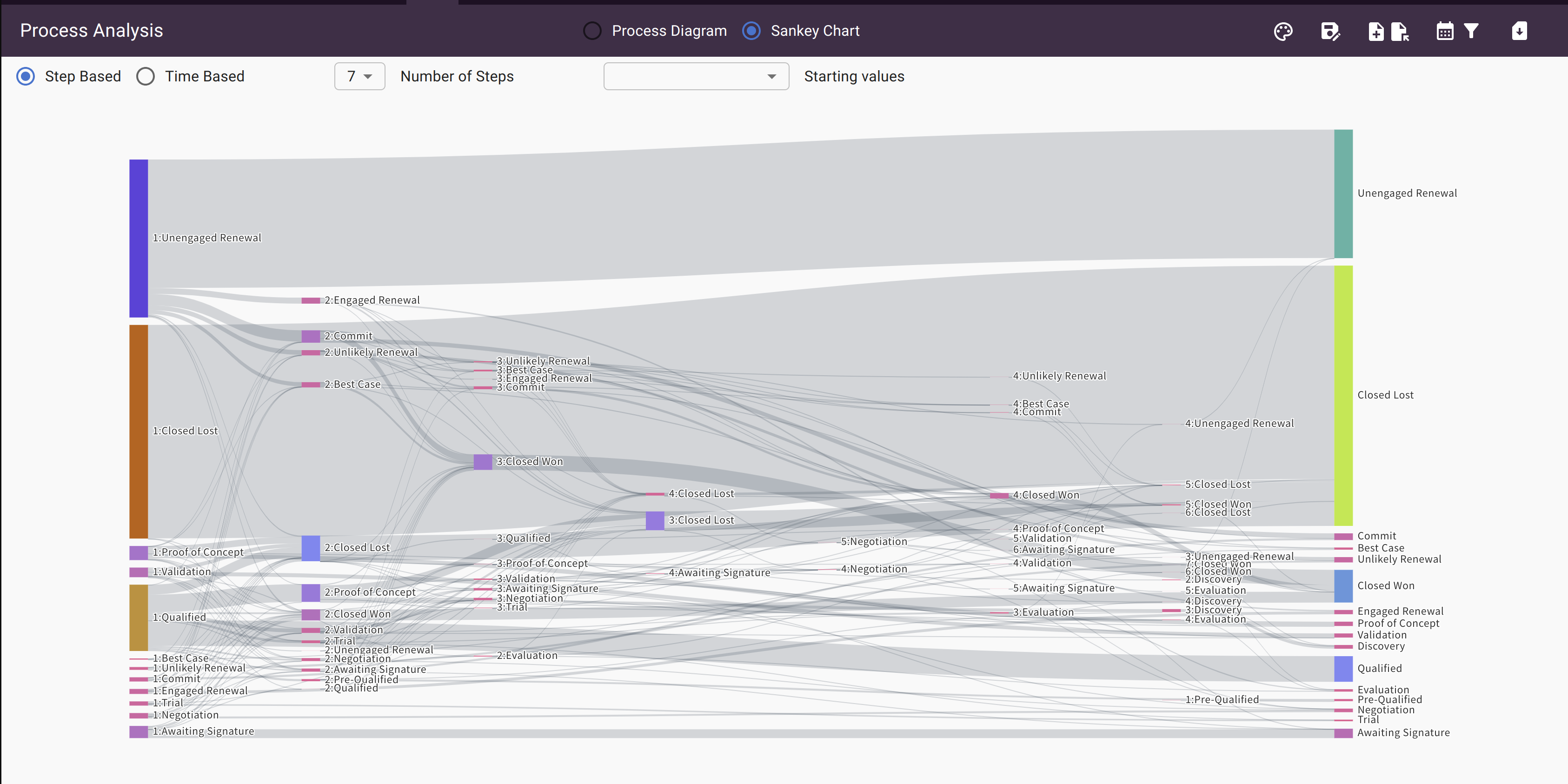
Another way of visualizing the same data is through a Sankey diagram. This diagram allows you to visualize how a population of items change over multiple steps. You can visualize the proportion of items at each step that move to some other stage in a next step. You can also highlight a desired outcome and see all the paths that lead there.
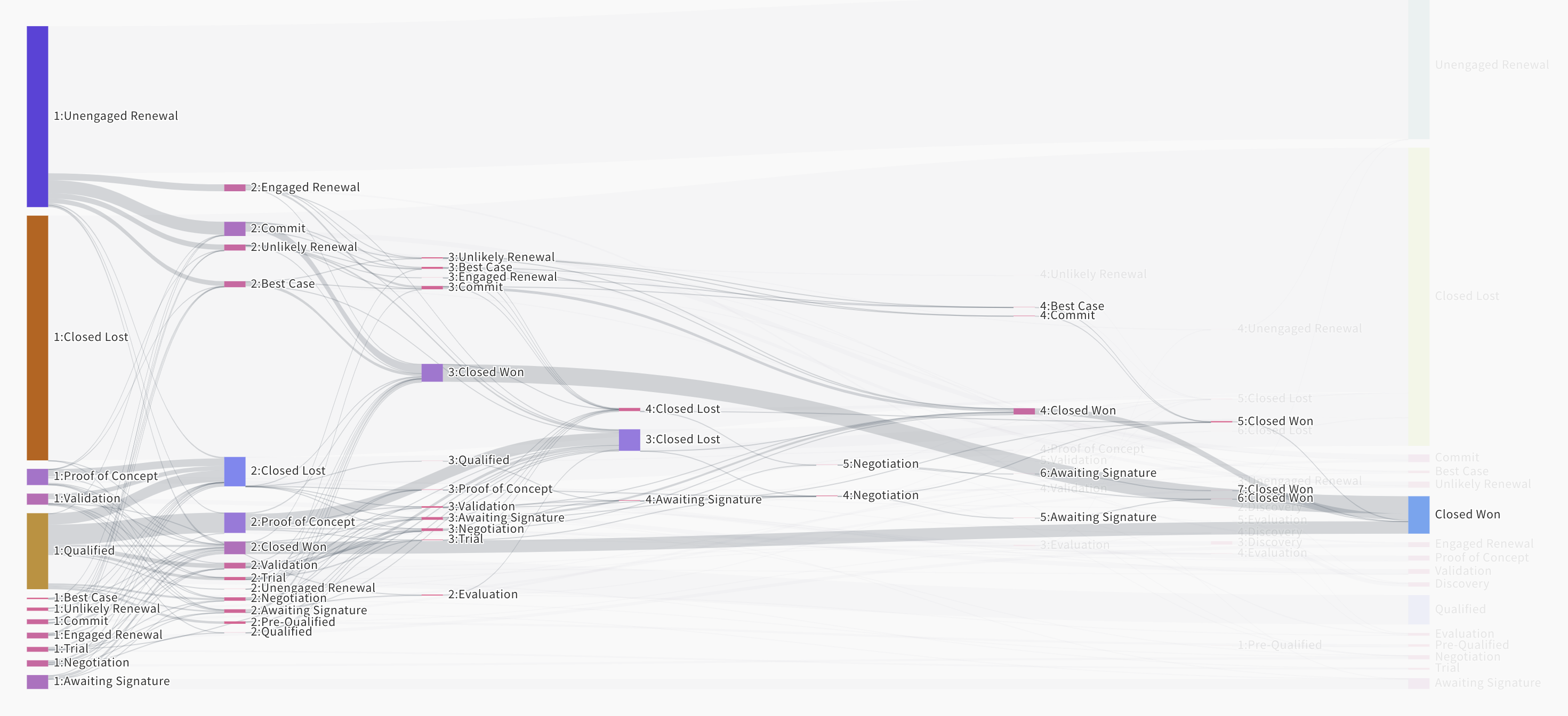
Scoop gives you the ability to visualize this by concrete steps, or by a given time period. Changing to time based allows you to see, in a fixed amount of time, how changes occur. Step based does not take time into account and just looks at where things go next, regardless of how much time it takes. Moreover, you can control the number of steps in the visual as well as often at some point there are diminishing changes as most populations end up in some sort of final state.
Creating KPIs from a Diagram (Charting rates over time)
Updated 8 months ago