Analyzing Data with Explorer
Create visualizations and uncover insights from your datasets
Explorer is Scoop's analysis and visualization tool. Use it to explore your data, create charts and tables, and build visualizations for your canvases.
What Explorer Does
| Capability | Description |
|---|---|
| Ad hoc exploration | Quickly slice and dice data to find insights |
| Visualization creation | Build charts and tables for canvases |
| Time series analysis | Track metrics over time with deep date intelligence |
| Category analysis | Compare across regions, products, segments |
| Drilling | Click any data point to explore deeper |
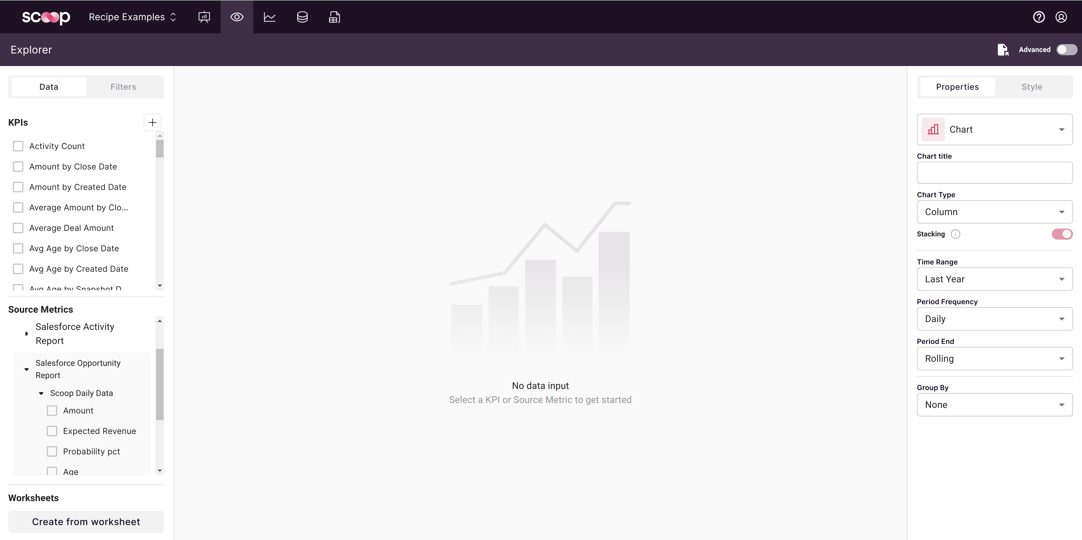
Opening Explorer
Click the Explorer icon (second in the main toolbar) to open it. Then:
- Select a dataset to analyze
- Choose metrics and dimensions
- View results as chart or table
- Save to add to canvases
Components of a Data Summary
Every visualization in Explorer combines these elements:
Source Metrics
Numbers in your dataset that can be aggregated:
| Aggregation | Use Case | Example |
|---|---|---|
| Sum | Totals | Total Revenue |
| Count | Volume | Number of Deals |
| Average | Typical values | Average Deal Size |
| Min/Max | Extremes | Largest Deal |
Scoop automatically detects numeric columns and suggests appropriate aggregations. If totals exist in your source data, Scoop learns your preferred aggregation method.
Attribute Columns
Dimensions by which you group your data:
- Text attributes: Region, Product, Rep Name, Status
- Date attributes: Created Date, Close Date, Order Date
- Categories: Stage, Type, Tier, Segment
Key Performance Indicators (KPIs)
Custom metrics that give you precise control:
- Override default aggregations
- Create formulas combining multiple metrics
- Define complex calculations (ratios, percentages, growth rates)
See Creating KPIs for details.
Filters
Narrow your analysis to specific subsets:
- Include only certain values (Region = "West")
- Exclude values (Status ≠ "Cancelled")
- Date ranges (Last 90 days)
- Numeric thresholds (Amount > $10,000)
Save filters for reuse across visualizations.
Two Analysis Modes
Time Series Analysis
Analyze how metrics change over time:
Revenue by Month
┌────────────────────────────────────────────┐
│    ▄▄                                      │
│   ████  ▄▄    ▄▄▄▄                        │
│  ██████████  ██████  ▄▄                   │
│ ████████████████████████                   │
│ Jan  Feb  Mar  Apr  May  Jun              │
└────────────────────────────────────────────┘
Scoop has deep date intelligence:
- Multiple date columns to choose from
- Automatic period detection (daily, weekly, monthly)
- Year-over-year comparisons
- Rolling averages
See Visualizing Time Series Data for details.
Category Analysis
Compare metrics across categories:
Revenue by Region
┌────────────────────────────────────────────┐
│ West     ████████████████████  $2.4M      │
│ Central  ████████████████      $1.9M      │
│ East     ██████████████        $1.7M      │
│ South    ████████████          $1.5M      │
└────────────────────────────────────────────┘
Use Advanced Mode for category analysis:
- Select any dimension as your axis
- Group by secondary dimensions
- Shows current state (latest snapshot for snapshot datasets)
See Visualizing Non-Time Series Data for details.
Creating a Visualization
Step 1: Select Dataset
Choose the dataset you want to analyze from the dropdown.
Step 2: Choose Metrics
Select which numbers to display:
- Click metrics from the list
- Multiple metrics can be shown together
- Adjust aggregation if needed
Step 3: Set Grouping
Decide how to group your data:
- By time: Select time period (day, week, month, quarter, year)
- By category: Enable Advanced Mode, select dimension
Step 4: Add Filters (Optional)
Narrow your results:
- Click filter icon
- Select column to filter
- Set conditions
- Apply
Step 5: Choose Visualization Type
Select how to display results:
| Type | Best For |
|---|---|
| Line chart | Trends over time |
| Bar chart | Comparisons |
| Stacked bar | Composition and comparison |
| Pie/Donut | Parts of a whole |
| Area chart | Cumulative trends |
| Table | Detailed data |
Step 6: Customize Appearance
Adjust visual styling:
- Colors and themes
- Fonts and sizes
- Labels and legends
- Axis formatting
Step 7: Save
Save your visualization to:
- Add to canvases
- Access later
- Share with others
Working with Results
Drilling Down
Click any data point to drill deeper:
- Click a bar → See breakdown by another dimension
- Click a slice → Explore that segment
- Use breadcrumbs to navigate back
Changing Views
Switch between visualizations without losing your query:
- Toggle between chart types
- Switch to table view
- Adjust time periods
Exporting
Export data for further analysis:
- Download as CSV
- Copy to clipboard
- Screenshot chart
Best Practices
Start Broad, Then Focus
- View overall trends first
- Identify anomalies or interesting patterns
- Drill into specific areas
- Apply filters to focus
Choose the Right Chart
| Data Type | Recommended Chart |
|---|---|
| Trends over time | Line or area chart |
| Comparisons | Bar chart |
| Composition | Stacked bar or pie |
| Distribution | Histogram |
| Correlation | Scatter plot |
| Details | Table |
Use KPIs for Precision
When default aggregations aren't right:
- Create a KPI with exact formula
- Reuse across visualizations
- Combine metrics into ratios
Save Filters for Reuse
For common subsets:
- Create saved filter definitions
- Apply consistently
- Update in one place
Troubleshooting
No Data Showing
- Check filters aren't excluding everything
- Verify date range includes data
- Confirm dataset has been processed
Wrong Aggregation
- Create a KPI with correct aggregation
- Check if metric should be sum vs. count vs. average
Chart Looks Wrong
- Verify correct chart type for your data
- Check axis scales
- Review grouping settings
Related Topics
- Charting Time Series Data - Time-based analysis
- Non-Time Series Data - Category analysis
- Creating KPIs - Custom metrics
- Interactive Charts - Charts on canvases
Updated 8 months ago