Period/Time Range Comparisons
Understanding what’s new, different, or notable about a particular period is at the heart of advanced analytics. With Scoop Data Science Studio (and chat), business users can easily discover changes over time—no coding or IT requests required. This guide walks you through using Scoop’s period/time range comparison features to reveal actionable insights for any date-driven dataset.
What Are Period/Time Range Comparisons?
Time comparisons analyze how a dataset has changed between two points in time or across defined periods (like months, quarters, or years). Scoop goes beyond simple before-and-after snapshots by automatically:
- Comparing any chosen period (e.g., "last quarter") against other periods or all remaining data
- Scanning for statistically meaningful differences, new patterns, or outliers
- Explaining, in plain language, what is interesting or notable about the period in question
- Providing both visual and written summaries—perfect for reports or executive briefings

How Scoop Makes Time Comparison Easy
Most tools require you to manually slice, filter, and wrangle data just to get basic before/after numbers. Scoop automates these steps:
- Automated Snapshot Loading: Scoop automatically loads and stores daily snapshots of your business data from over 100+ SaaS and manual sources.
- Semantic Date Understanding: Whether your dataset uses "Close Date," "Order Date," or "Snapshot Date," Scoop recognizes and uses your business’s date columns for comparison.
- ML-Powered Differences: Rather than just show what went up or down, Scoop automatically runs a classification analysis, highlighting what changed, why, and which factors are most important.
- Easy Questions in Plain English: Simply ask, "What’s different about last month versus before?"—Scoop handles the rest.
Tip: No need to set up data pipelines or write SQL queries—Scoop does complex historical comparisons with just a few clicks or a chat prompt.
Typical Use Cases
- Sales Trends: Find out what changed this quarter vs. last: which deals closed, what products gained traction, or whether certain sales teams improved.
- Customer Behavior: Spot what’s new with this month’s signups, churn, or ticket trends compared to historical norms.
- Operational Metrics: Understand anomalies, like why service times improved (or slowed) in a recent week.
- Inventory/Finance: Instantly see which products, categories, or accounts shifted most within a period.
Step-by-Step: Running a Period Comparison
- Connect or Load Your Data: Ingest a dataset with date or timestamp columns. (Scoop auto-detects and suggests time-based analysis if available.)
- Open Data Science Studio: From any dataset, find the Analyze or Explore panel and select Compare Periods or ask a natural language question like "What’s different about March 2024?"
- Choose Your Periods: Scoop presents an intuitive picker—select a base period (e.g., March 1–31) and optionally a comparison period (e.g., February 1–28, or "all prior months").
- Preview & Run Analysis: Click to run. Scoop applies machine learning to compare the two periods, analyzing all attributes—not just simple metrics.
- Review Results:
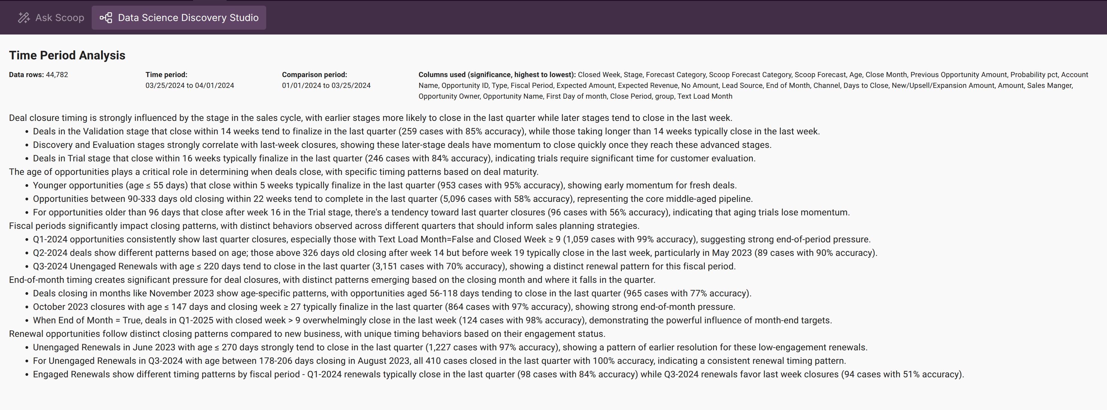
- Plain Language Summaries: Bullet points summarize the key differences, drivers, and what’s unusual about your selected period.
- Visualizations: See what’s changed in charts, graphs, and tables—auto-generated for you.
- Rule Explanations: If significant change-drivers exist (e.g., "Deals closed faster for enterprise accounts"), Scoop provides terms anyone can understand.
What’s Happening Under the Hood?
Scoop’s engine:
- Scans datasets row-by-row, builds "before" and "after" populations based on your defined time range
- Uses robust ML models (classification algorithms, rule learning) to figure out what most distinguishes records in the chosen period
- Surfaces only statistically meaningful, non-obvious drivers (e.g., "Revenue growth was mainly in the East region with 40% more enterprise deals than usual")
- Summarizes these findings in plain English, so you don’t have to interpret model output yourself
Tip: It’s not just about raw increase/decrease—the machine learning explains which factors or patterns caused the change, not just that a change happened.
Best Practices & Tips
- Pick Meaningful Periods: Comparing a recent month/quarter vs. "all time" can highlight both short-term spikes and long-term shifts.
- Let Scoop Recommend: Unsure which period to analyze? Scoop uses dataset semantics to recommend interesting timeframes automatically.
- Check for Granularity: Fine-tune your comparison by changing aggregation level (daily, weekly, monthly, quarterly).
- Export for Sharing: Results can be turned into slides, summaries, or shared links for zero extra work.
- Iterate with Questions: Try different periods or ask more specific prompts ("How did new accounts in March differ from February?").
Real Example Questions You Can Ask
- "What’s different about Q1 2024 sales versus Q4 2023?"
- "Which customer types drove most of the change in support volume last month?"
- "How did product returns change in March compared to the rest of the year?"
Summary
Scoop’s time comparison tools empower analysts and business users alike to quickly reveal not just what changed but why—all without technical hurdles. With machine learning-powered explanations, auto-visualization, and friendly summaries, you can bring powerful, human-understandable change analysis to your team’s decision-making—fast.
Tip: Want a quick summary of "what’s new" each week or month? Set Scoop to automatically snapshot and compare, so your reports are always fresh and focused on what matters most.
Updated 6 months ago