# Tables and Pivot Tables
View and analyze your data in flexible tabular formats
Tables provide a direct view of your data, while pivot tables let you summarize and cross-tabulate dimensions. Both are essential tools for understanding what's in your dataset.
# Data Tables
By default, when you select a table it displays your data by time (usually by snapshot or load date):
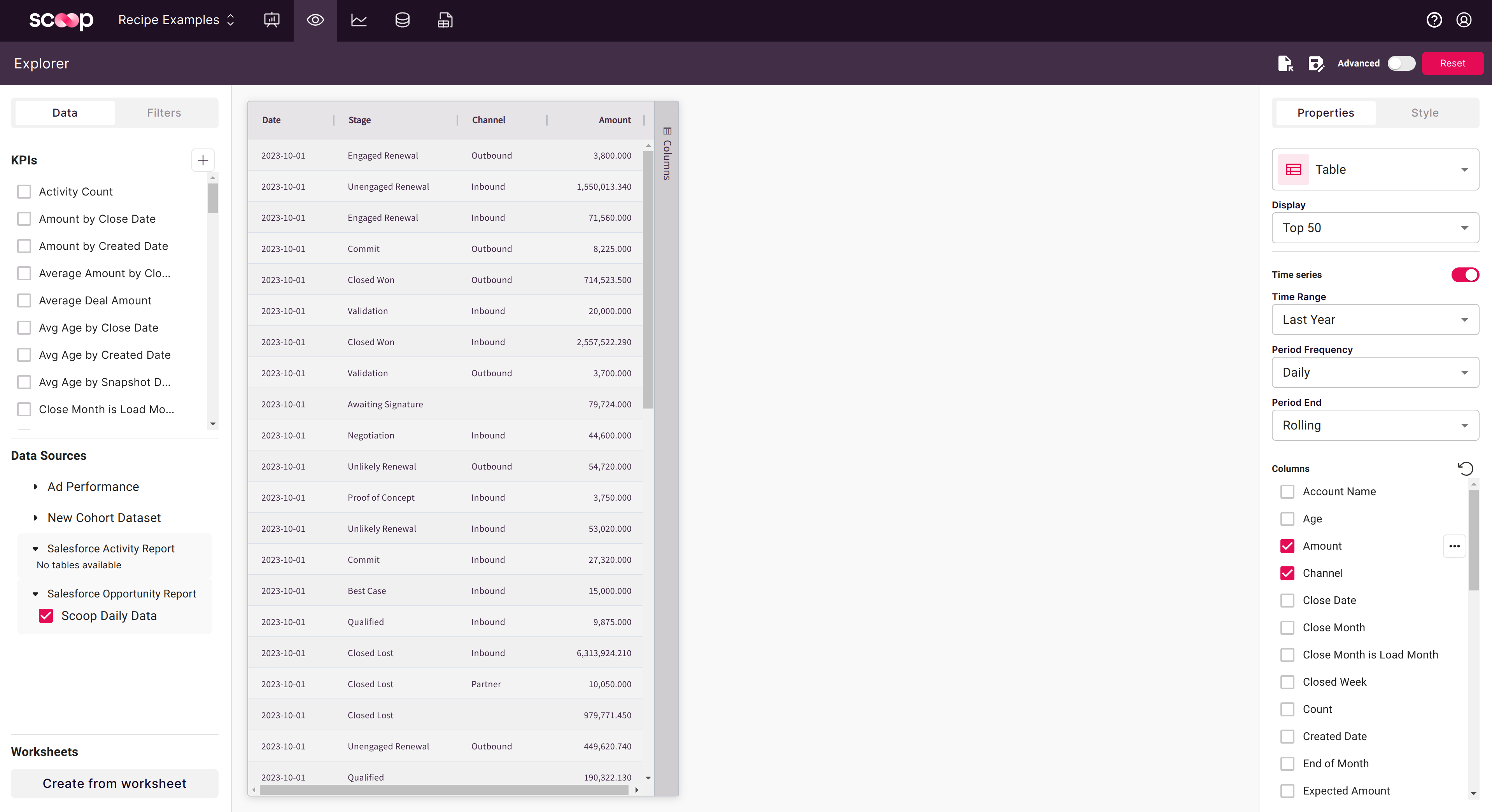
## Time Series Toggle
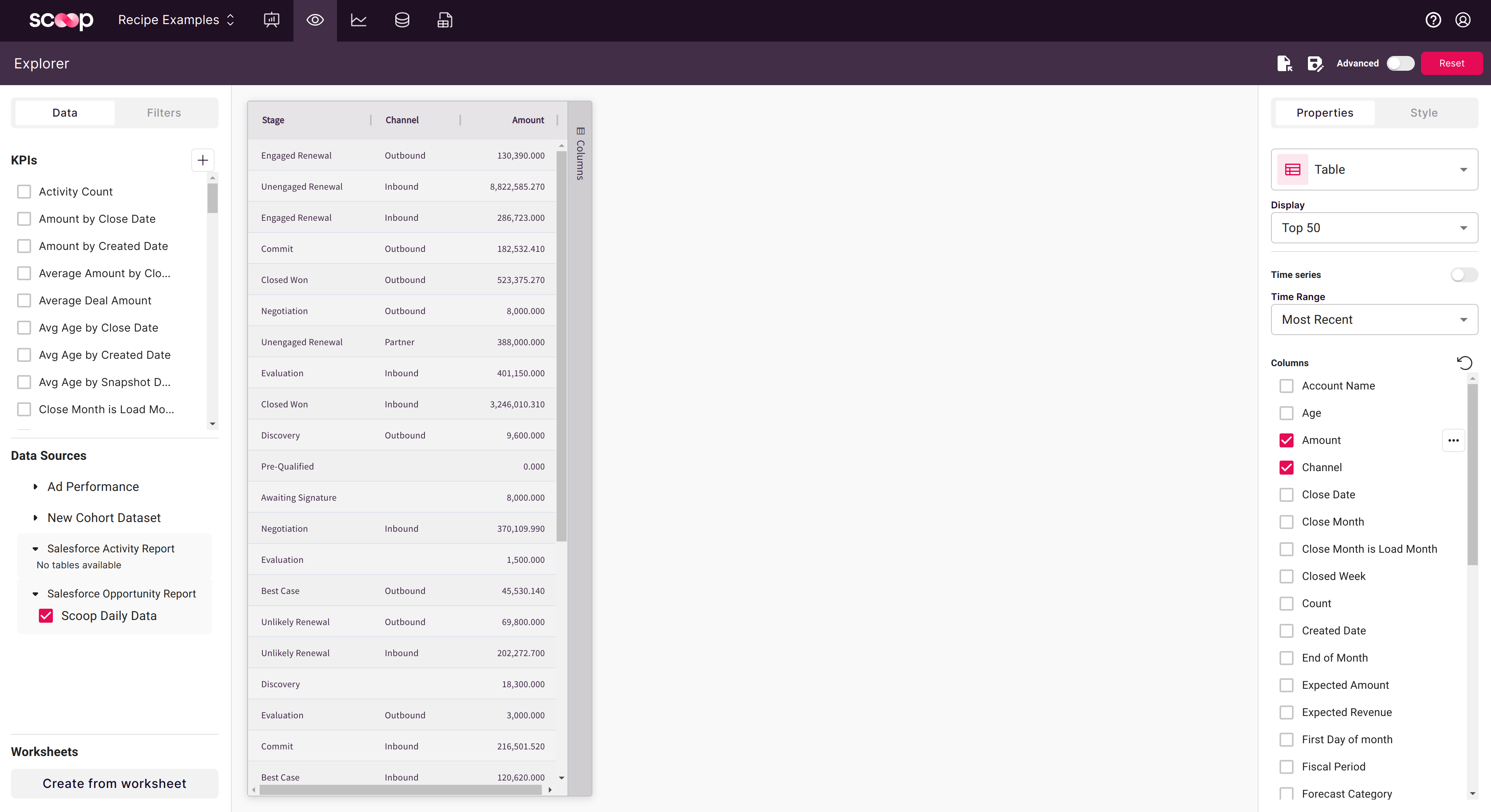
Click the **Time Series** slider to change how data is aggregated:
| Mode | Description |
|------|-------------|
| **Time Series ON** | Groups data by date, shows trends over time |
| **Time Series OFF** | Aggregates across all dates into summary |
## Time Range Selection
By default the time range is set to "Most Recent", limiting to the latest load. You can extend this:
- **Most Recent**: Latest snapshot only
- **Last 7 Days**: Rolling week
- **Last 30 Days**: Rolling month
- **Custom Range**: Specify start and end dates
- **All Time**: Complete history
This is especially useful for non-snapshot (transactional) datasets where you want to analyze all historical records.
## Table Features
| Feature | How To |
|---------|--------|
| **Sort** | Click column header |
| **Multi-sort** | Shift+click additional columns |
| **Filter** | Use Filter tab in left panel |
| **Show/Hide Columns** | Uncheck in column list |
| **Export** | Click Export button for CSV/Excel |
# Pivot Tables
Pivot tables let you summarize data by grouping rows and pivoting columns. Click the table bar to the right of your table to open pivot options:
## Enabling Pivot Mode
Click the **Pivot Mode** slider to enable two key capabilities:
- **Row Grouping**: Nest dimensions hierarchically
- **Column Pivoting**: Spread an attribute across column headers
## Row Grouping
With row grouping, you can expand and collapse individual items to progressively drill into your data:
**To create row groups:**
1. Enable Pivot Mode
2. Drag columns to the row grouping area
3. Order determines nesting (top = outermost)
4. Click expand (+) icons to drill down
**Example hierarchy:**
```
Region (outer)
└── State (middle)
└── City (inner)
```
## Column Pivoting
Drag an attribute to the column labels area to pivot it across columns. For example, dragging "Channel" creates column headers for each channel value:
**Best practices for column pivoting:**
- Choose dimensions with 3-10 unique values
- High cardinality columns (100+ values) create too many columns
- Time periods (Quarter, Month) work well as column pivots
## Pivot Table Metrics
At each intersection of row and column, Scoop calculates your selected metric:
| Aggregation | Best For |
|-------------|----------|
| **Sum** | Revenue, quantities, totals |
| **Count** | Number of records |
| **Average** | Rates, percentages, scores |
| **Min/Max** | Ranges, outliers |
| **Distinct** | Unique counts |
# Common Pivot Patterns
## Sales by Region and Quarter
**Configuration:**
- Row Groups: Region, Rep
- Column Pivot: Quarter
- Value: Sum of Revenue
**Result:**
```
Q1 Q2 Q3 Q4
West $450K $520K $480K $610K
Sarah $180K $210K $190K $240K
Mike $150K $170K $160K $200K
Lisa $120K $140K $130K $170K
Central $380K $410K $420K $520K
```
## Pipeline by Stage and Owner
**Configuration:**
- Row Groups: Stage
- Column Pivot: Owner
- Value: Sum of Amount, Count of Deals
**Result:** See pipeline distribution across reps at each stage
## Conversion by Source and Month
**Configuration:**
- Row Groups: Lead Source
- Column Pivot: Month
- Value: Count of Leads, Count of Customers, Conversion Rate
**Result:** Track which sources convert best over time
# Working with Large Datasets
## Performance Tips
1. **Filter first**: Narrow data before pivoting
2. **Limit dimensions**: Use Top N for high-cardinality columns
3. **Date rollups**: Group by month vs day
4. **Pre-aggregate**: Create blended datasets for common analyses
## Row Limits
| Context | Limit |
|---------|-------|
| Preview | 1,000 rows |
| Full view | Up to 10,000 rows |
| Export | Unlimited |
# Exporting Tables
## Export Options
Click **Export** to download:
| Format | Use For |
|--------|---------|
| CSV | Data processing, imports |
| Excel | Offline analysis, pivot tables |
Export includes:
- Current filters
- Sorting
- All visible columns
- Full data (not just visible rows)
## Adding to Canvases
To embed tables in presentations:
1. Configure your table in Explorer
2. Click **Save** and name it
3. Open your canvas
4. Add the saved table as an object
5. Table updates when data syncs
# Troubleshooting
## Table Shows No Data
- Check active filters
- Verify time range includes data
- Confirm dataset has synced
- Look at column selection
## Pivot Totals Don't Match
- Check for null values in grouping columns
- Verify aggregation type
- Some rows may be excluded by filters
- Compare to ungrouped table view
## Slow Performance
- Add filters to reduce data
- Limit pivot dimensions
- Use monthly vs daily grouping
- Consider pre-aggregated datasets
# Related Topics
- [Filtering Data](filtering-data) - Narrow your results
- [Charting Time Series Data](charting-time-series-data) - Visualize trends
- [Non-Time Series Data](non-time-series-data) - Aggregate analysis
- [Visual Themes](visual-themes) - Style your tables